Now that I know what environment I can move onto the actual production of the environment. Below you can see the greybox shots of the environment, which is where I will be starting the modelling from.
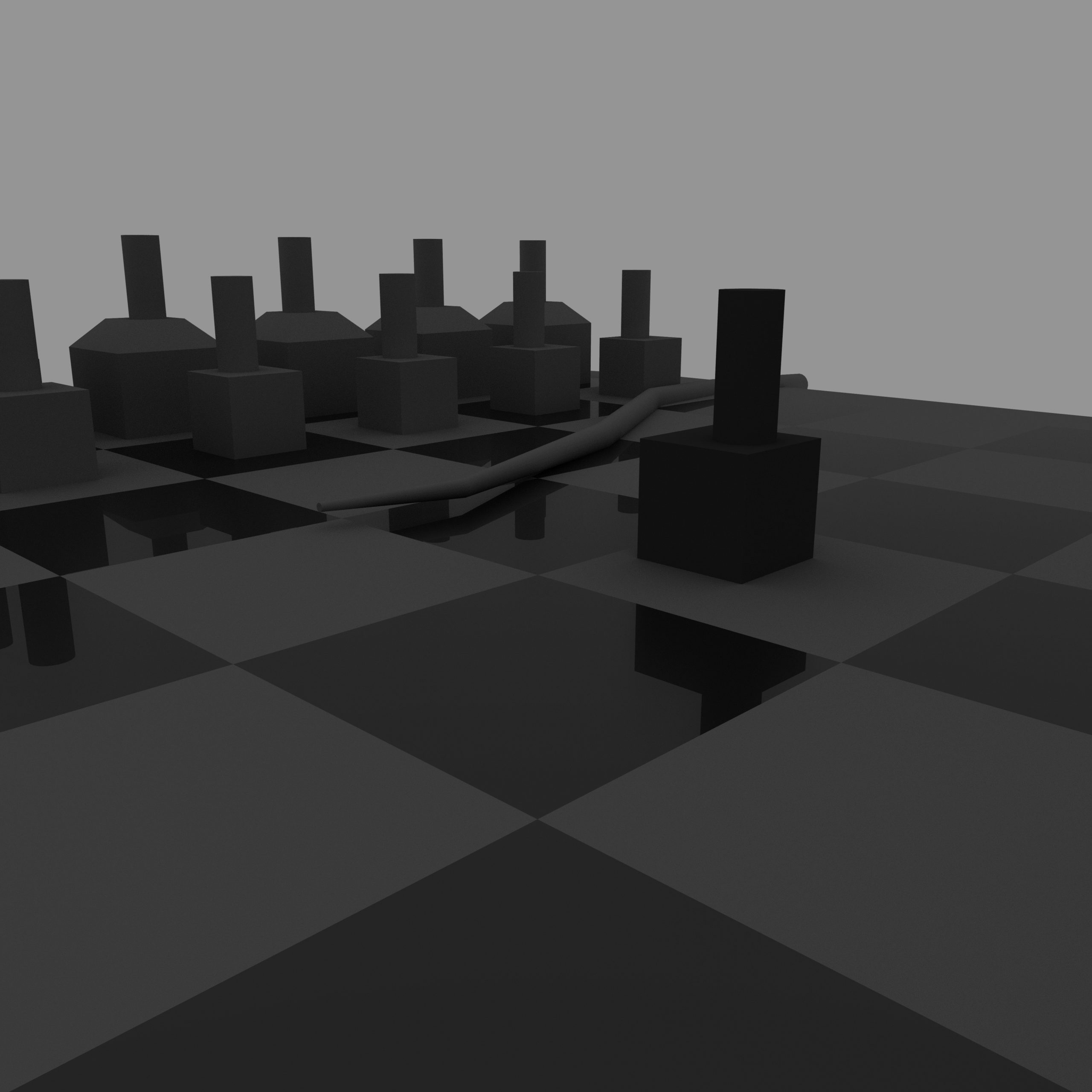
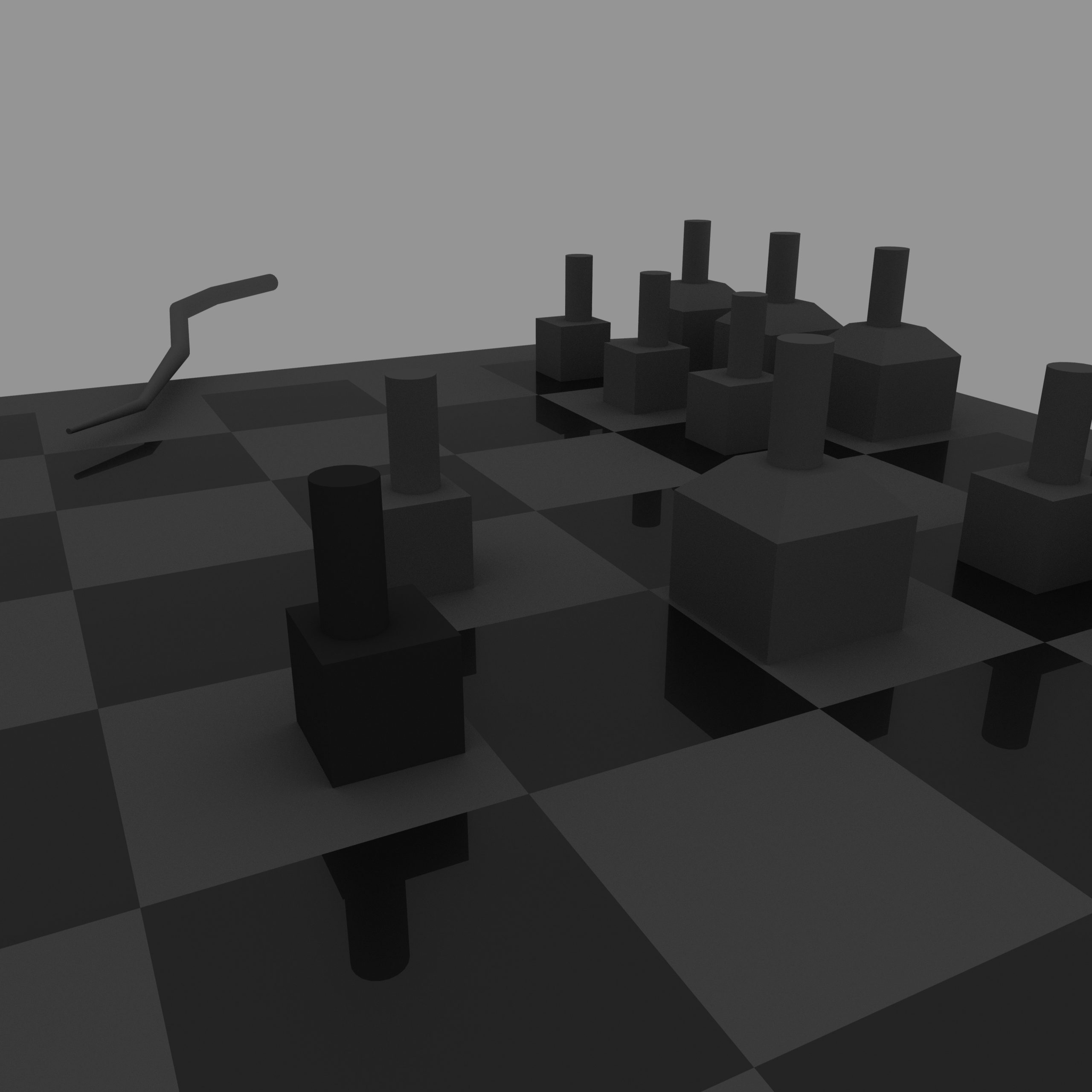
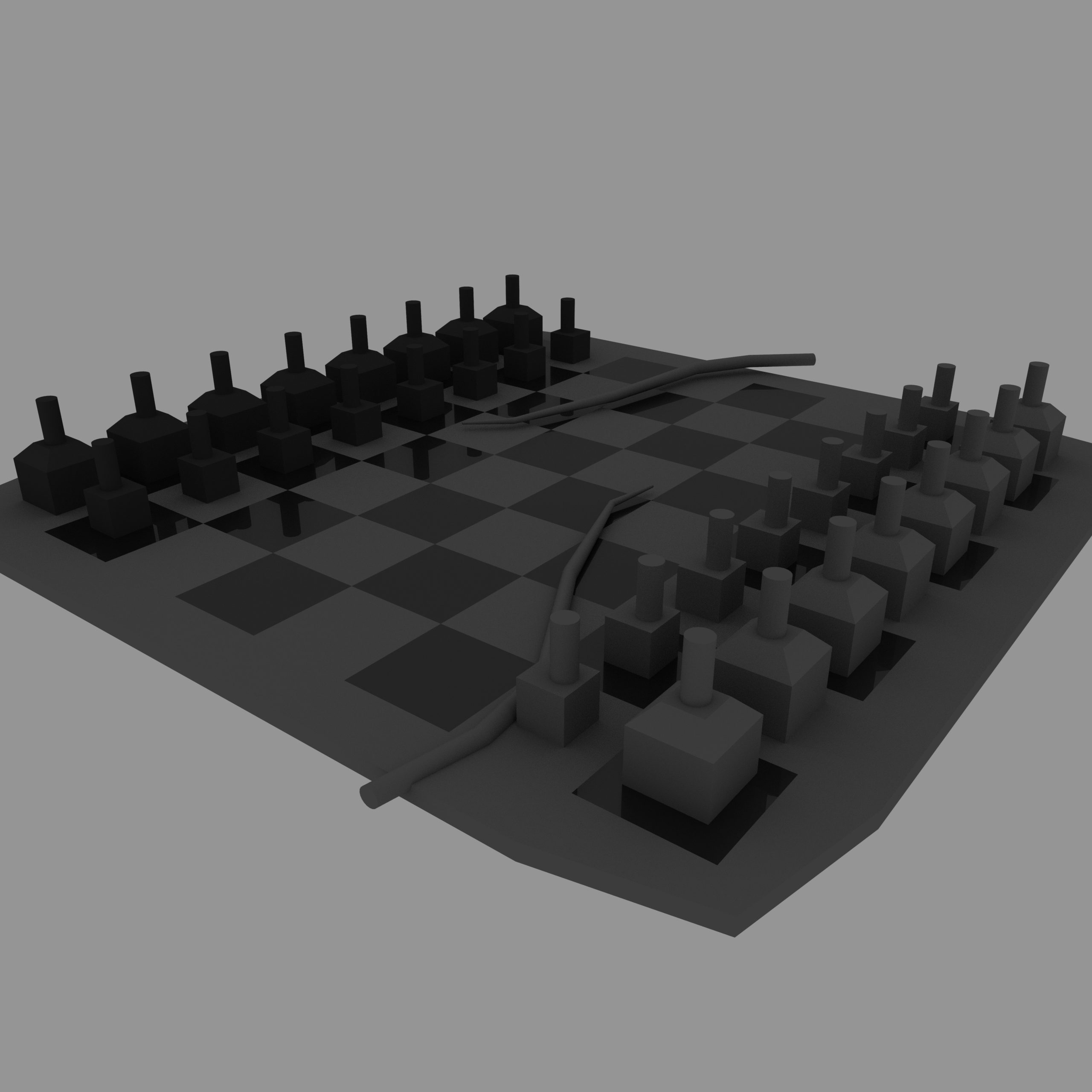
One of the questions I do have about the production for this environment is how many individual people models I will need to create. I want the different figures to represent different figures in the life of a young girl in Victorian England (the queen representing mum, and the king being dad for example). This means that for each voice line I want to include, which is how I will represent the theme of women’s expectations from the book, I will need to model a new character.
:: Board Modelling & MASH Vines ::
I figured the easiest place to start would be to model the chess board itself (fig.1), this is because while modelling wise the board is very simple, it would make a huge difference in terms of the final visual. This asset will require a high quality texture map, which will need to show the different details and colours that are required to make it clear that the board is from a chess set.
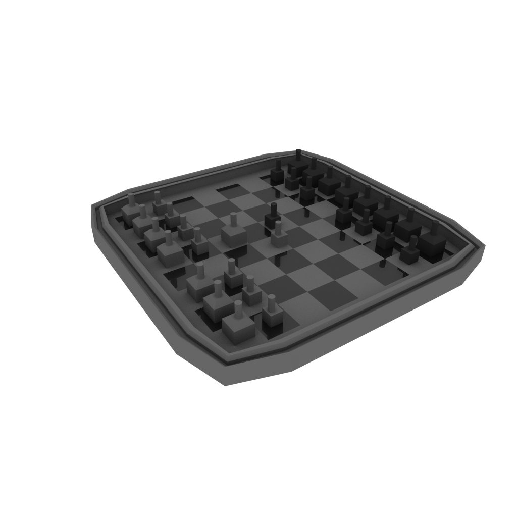
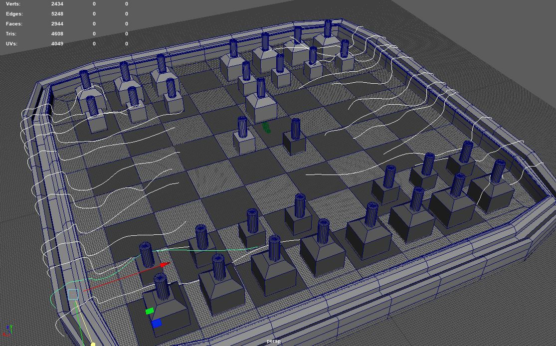
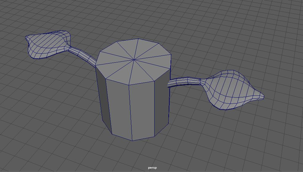
Then, I added the various curves which my vines will follow along (fig.2) it was important that these curve lines seemed unique enough from each other that the vines appear appropriately cluttered. By using MASH to create the vines I only need to model one segment of the vine (Fig.3). This is a much more efficient way to create something like a vine as you only have a small model to texture, which means a larger UV map, which means a higher quality texture image.
I am familiar with MASH to model things such as tank treads in the past and know a very useful video which goes over some of the common issues you run into when attaching a model to a curve node in MASH.
The common issues I tended to find when using MASH were things like the orientation of the segment I have being wrong when connected to a curve, so a simple video like this is something I go back to often when I create things like chains, treads or vines.
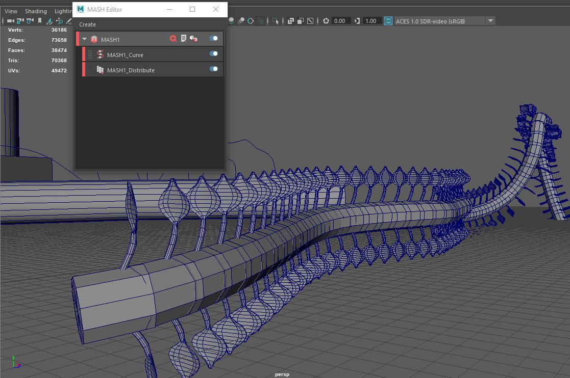
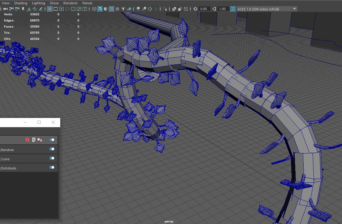
The vines were pretty simple to make, just requiring duplicating along a curve using a curve node (fig.4) and then adding a randomiser (fig.5) which would allow the leaves to appear as though they were growing from all directions. This method was never going to create the highest quality vine, but for what I wanted it both allowed me to model them quickly and efficiently as well as gives me the potential to animate them growing when I render the scene using Arnold.
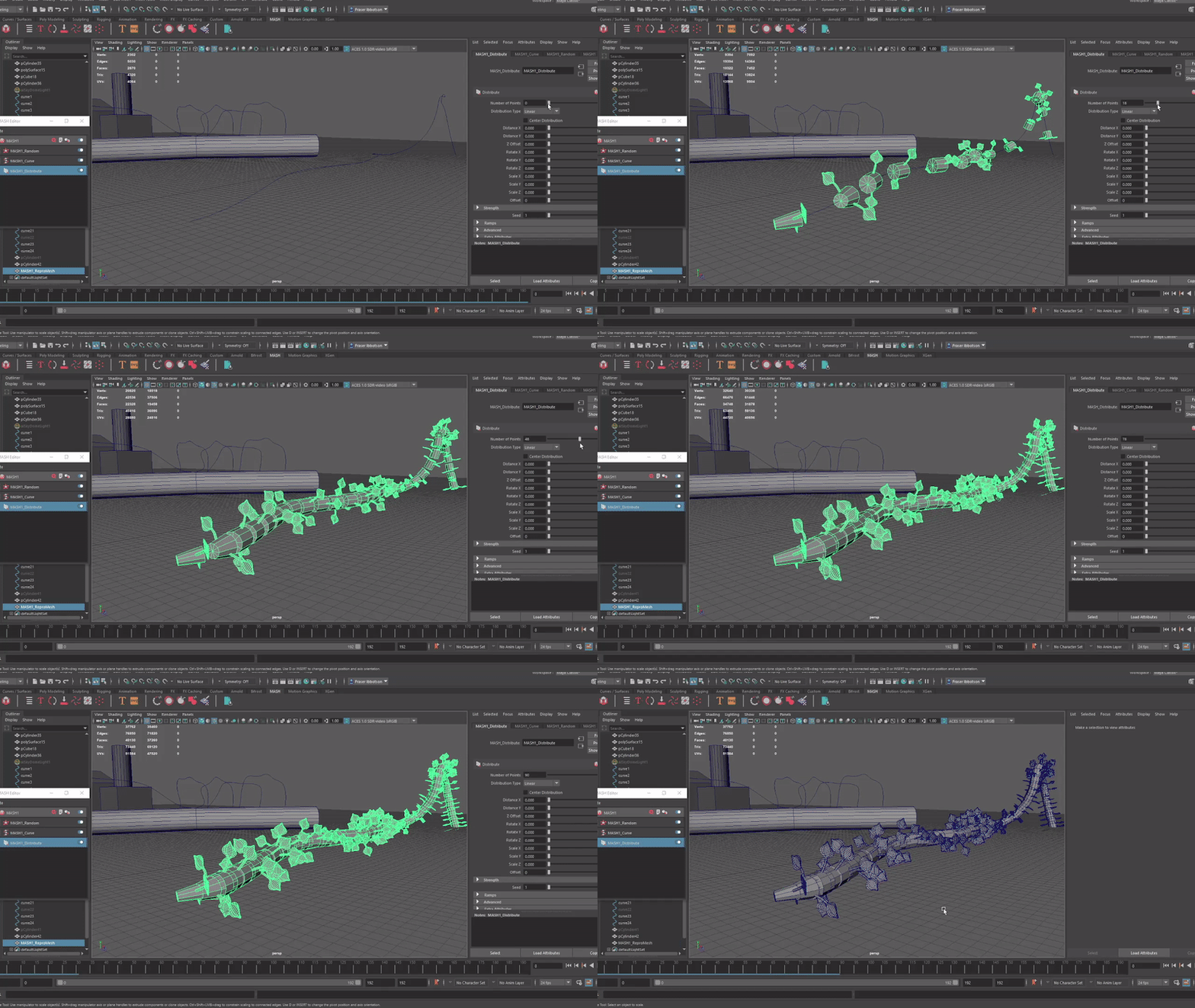
I noticed at this stage that the vine didn’t grow along the curve the way I would want if I were to animate them to appear as though they are growing. Instead of growing from one end and moving across the other they sort of spawned and then shrunk the distance between segments as you increased the number spawned.
This would have posed an issue with animating the scene, although as I later found out I didn’t end up animating the vines in my final scenario. (We cover why this changed further below)
:: Daz Studio ::
The next issue I had to tackle came in how to quickly create the various figures I would need. To create the characters from scratch was simply not feasible in the time limit I had. Luckily, when I researched how characters are made in studios, I came across the below video (FlippedNormals, 2021) which discussed using a software called DAZ studio to automatically generate very basic figures and pose them accordingly.
The above video did a great job showing how DAZ is used as a part of the modelling pipeline, however the pipeline I was following was slightly different. For starters I wasn’t using DAZ to create the base mesh to then edit in ZBrush, but rather using those figures from DAZ to create basic statues in Substance Painter. The video also didn’t really break down how to use the software, so I had to look elsewhere for this knowledge.
Thankfully I found the below video series (David,S, 2020) which detailed how to navigate the software as well as creating basic models with custom poses. This was something that would be incredibly useful, however it wasn’t long after this that the larger issues with my idea selection came to light.
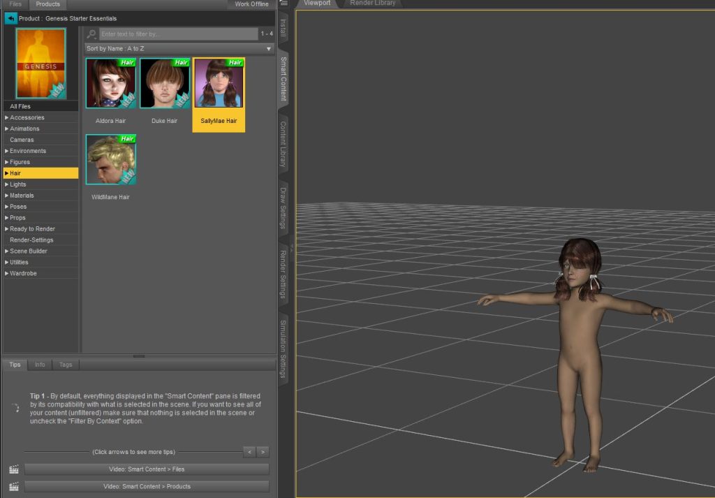
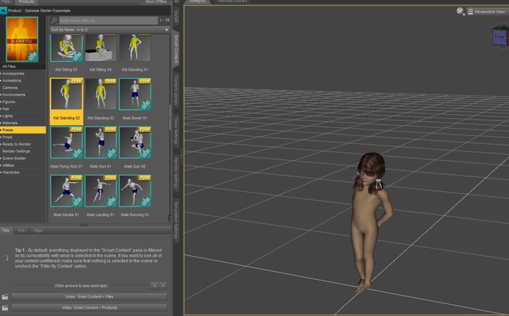
Using DAZ I was able to select a basic androgynous child model (fig.6). The software also allowed me to find a suitable pose very quickly (fig.7) however I wasn’t really happy with this pose for the character. I found it personally a bit to sensual a pose for what was supposed to be a Victorian era young girl.
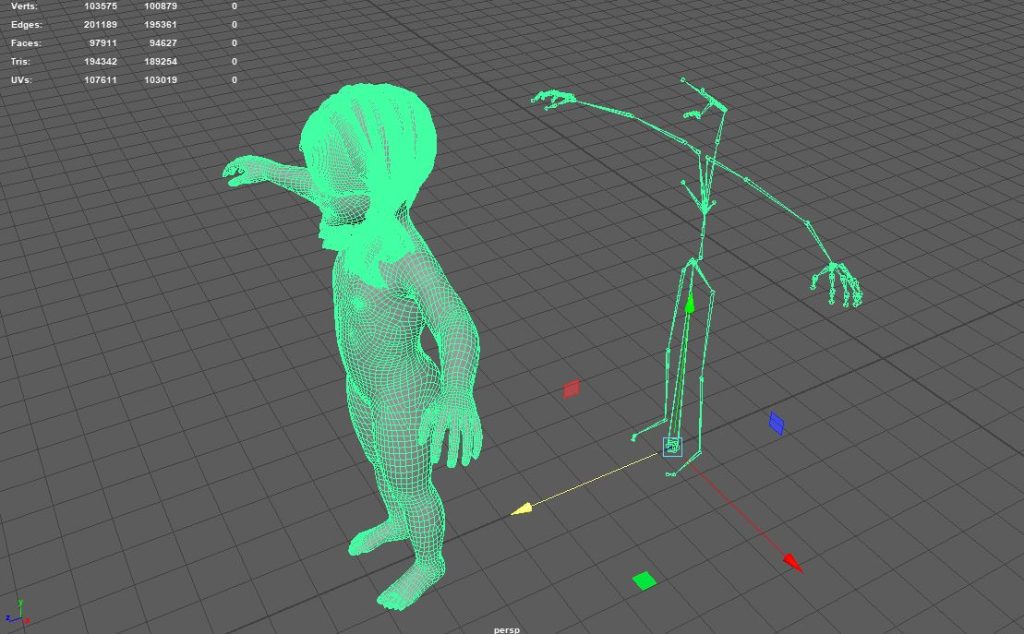
I did discover when I imported the character into Maya that DAZ also created a skeleton rig for the character (fig.8) this was incredible as it meant that I could create custom poses for the character in Maya, and animate them using the same techniques I used in the 3d character animation module from second year.
At this stage I had a base model with no clothes in a T pose but with a fully rigged skeleton. I had kept the model in a T pose for now as the software I was going to use to create the characters clothing (Marvelous Designer) required this from models that were imported. The plan had now changed to clothe the character, then either use the base pose previous discussed from DAZ (Fig.7) or manually create a pose using Maya.
:: Creating Clothing (Marvelous Designer) ::
With this new plan in mind I found references for the clothing I wanted to create (ref.1, ref.2). This needed to be something simple enough for me to create using an unfamiliar software. Also I found a useful reference for the pose I originally wanted the character to stand in. The little girl was going to be the pawn for the scene, to represent Alice’s desire to buck from the roles assigned to her by society in the original text. The pawns were intended to show how little girls were expected to behave by their elders, so a pose such as that found here (ref.3) would help play into the themes of the scene.
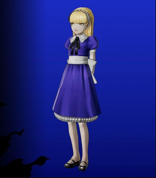

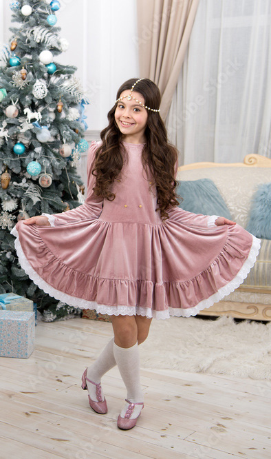
I chose to use Marvelous Designer as it’s the industry standard software for creating clothing, as such it would be good practise for me to start learning the basics of using the software before I graduate and start looking for employment.
One of the issues I found at this stage was regarding scale in the different software. The mesh provided by DAZ was the correct size needed for Maya, however when ported into Marvelous Designer the model was far smaller than the software intended. This caused problem when creating circularised pieces of clothing as they would appear jagged, like when you zoom into a cylinder in Maya and can see the various flat faces that make up the curve. (Fig.9)
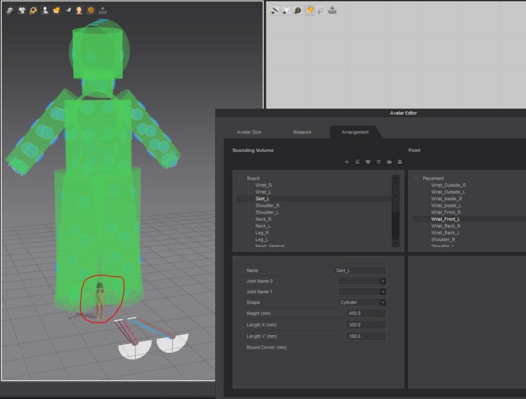
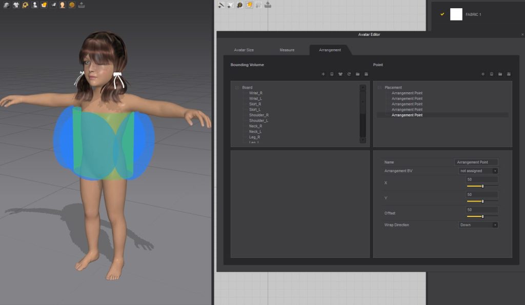
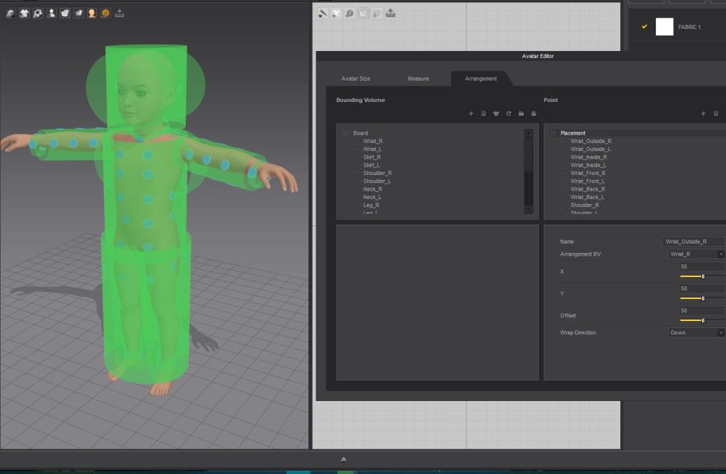
There is a way to resize the placement points of the model you import (fig.10), as shown well in the below video (Pixel Fondoue, 2020) however, I found that the mesh imported was so small compared to what Marvelous designer asks for that even using the tools available for this issue didn’t work for attaching the clothing to the model. The placement points (blue dots) were simply far too large for them to effectively work as anchor points for the clothing created.
Eventually I just ended up increasing the size of the character model, then importing the mesh back into Marvelous Designer (fig.11). This may seem like the obvious solution however this created clothing that is far larger than intended and as the clothing created in Marvelous Designer are flat planes with only outside faces enabled scaling the clothing down could cause problems with self-clipping later on.
With the issue regarding scaling put (however temporarily) behind me I moved onto the fun part, actually creating the clothing for the character. The dress was going to be very simple, really only needing a skirt, top and sleeves. This was because I was turning the character into a statue, so adding too much complexity here would at best be lost when all textured stone coloured or worse, actively make the visual too complicated for comfortable viewing. Especially when close up to the model as you are in VR.
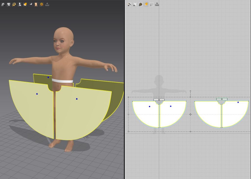
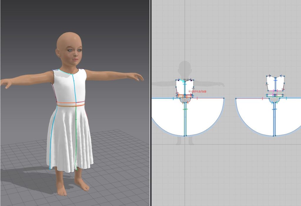
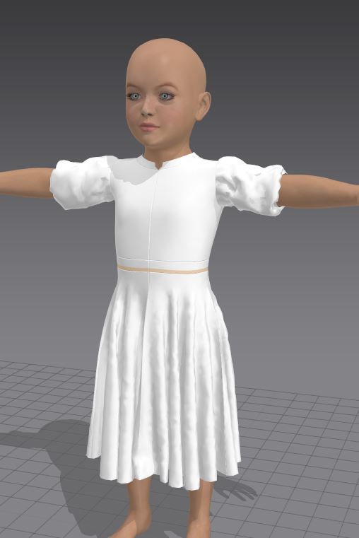
I used the above video to help create the folds needed in the skirt (Marvelous Designer, 2020) It was a fairly simple process, using only rudimentary if oversized shapes for the skirt pieces (Fig.12). The shirt was even simpler being fairly form sitting (Fig.13) and I used the same idea with the arms as I did for the skirt (Fig.14), knowing that oversized pieces resulted in the folds prevalent in Victorian era clothing.
I actually quite liked using Marvelous Designer, and felt as though I could have sunk a large chunk of time in creating the perfect garments for the character. However, I needed to remember that this wasn’t going to be the only piece of clothing I created for the project, and I couldn’t afford to spend all my time exploring this new software, no matter how much I may have wanted to.
:: Pocket full of Issues ::
It was at this stage that the issues I had been pushing aside came to the front, most prominently we had trying to get the clothing from Marvelous Designer to work with the model in DAZ. By default the DAZ model was bonded only to the mesh skin, but not the clothing mesh I would import (fig.15). This meant that the body would simply clip through the clothing.
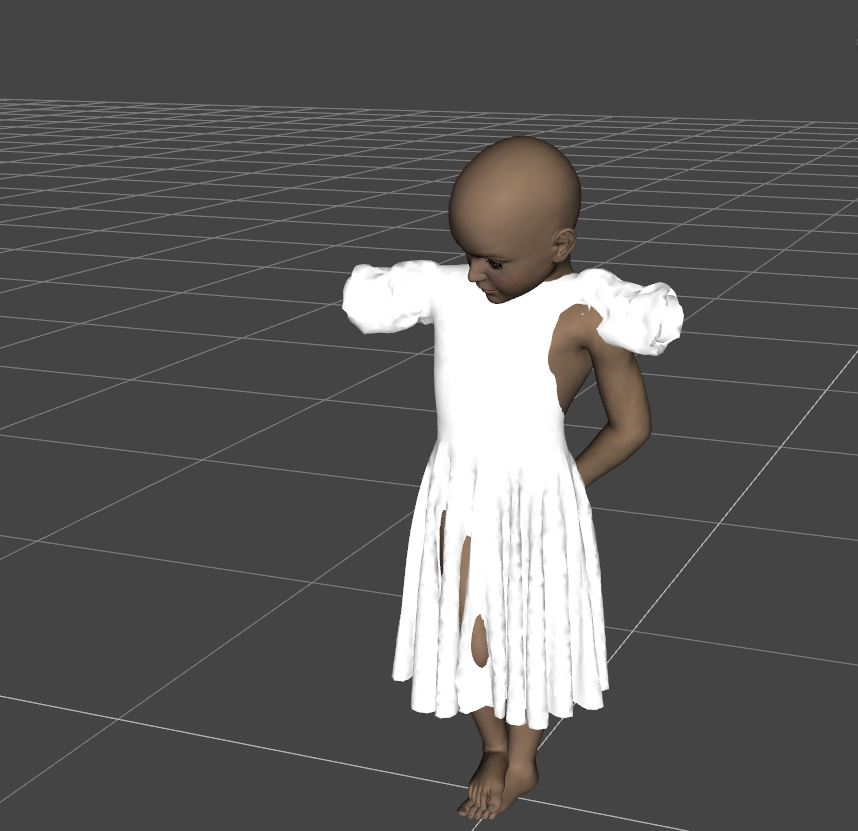
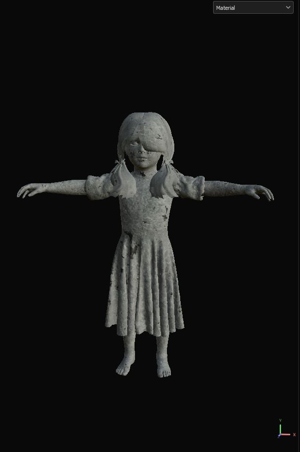
I did find a livestream where someone was tackling this very issue (The WP Guru, 2021), however as this is not a tutorial, I found it rather difficult to follow. This meant that I had no choice but to bring the default child model from DAZ and the dress mesh I had made both into Maya as a T-Pose; texturing the model plus dress still in the pose (fig.16) before then binding the body and dress mesh to the skeleton rig DAZ generated.
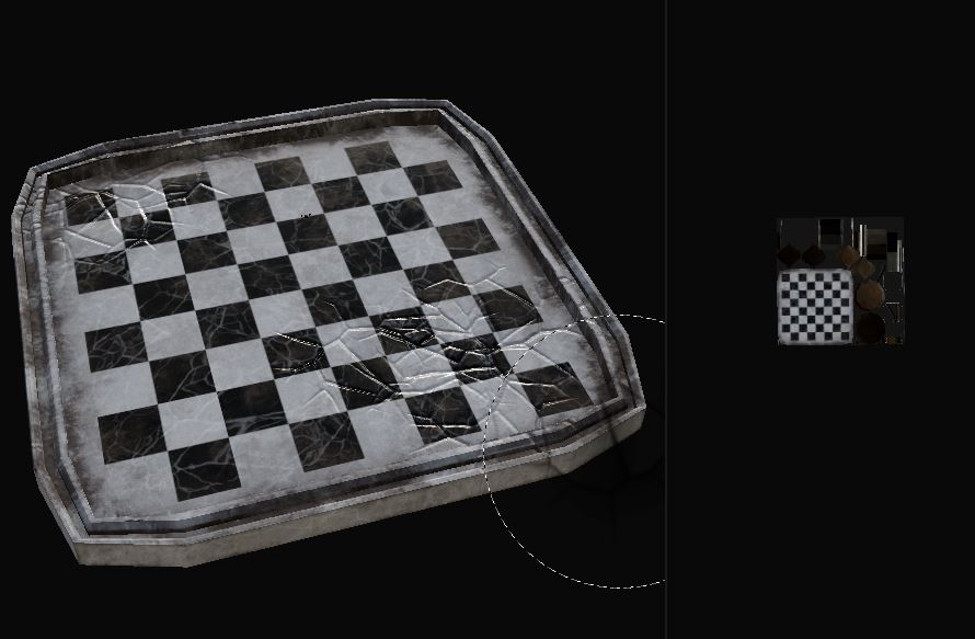
This then resulted in a different issue which was the back of the girl clipped through the dress when moving the shoulder joints to have the arms placed behind her. This would require me to alter the weight paints of the model which quickly made clear the scale of the task I had set myself. I did briefly continue with the other aspects of the project, such as texturing the chessboard (Fig.17) but after this I really had no other way to progress with this scene without extensive animation.
Now, I enjoyed my time with the animation module last year well enough, but as my low mark will attest to it wasn’t exactly a field I am particularly strong in. Plus, to require me to both remember what I learnt during that moduel as well as implement it repeatedly with the different characters I would still have to create would be a huge task.
Plus there’s the issues I found with rendering VR using Arnold (as described in my Evaluating Ideas post). I don’t know how you export animations into Unreal Engine, which means either learning this technique or being forced to render using Arnold, which had not gone well previously.
:: Changing Plans ::
With this in mind I decided to go back to my three environment ideas. The other two I have explored are both more designed around static environments than the chessboard scene, and with one of them (the tea party) only requiring me to model one small interior environment rather than a rollercoaster ride through many different outdoor environments the choice for which scenario I would pivot to create was clear. I would now be creating a tea party type scenario where you must escape the room within the short video.
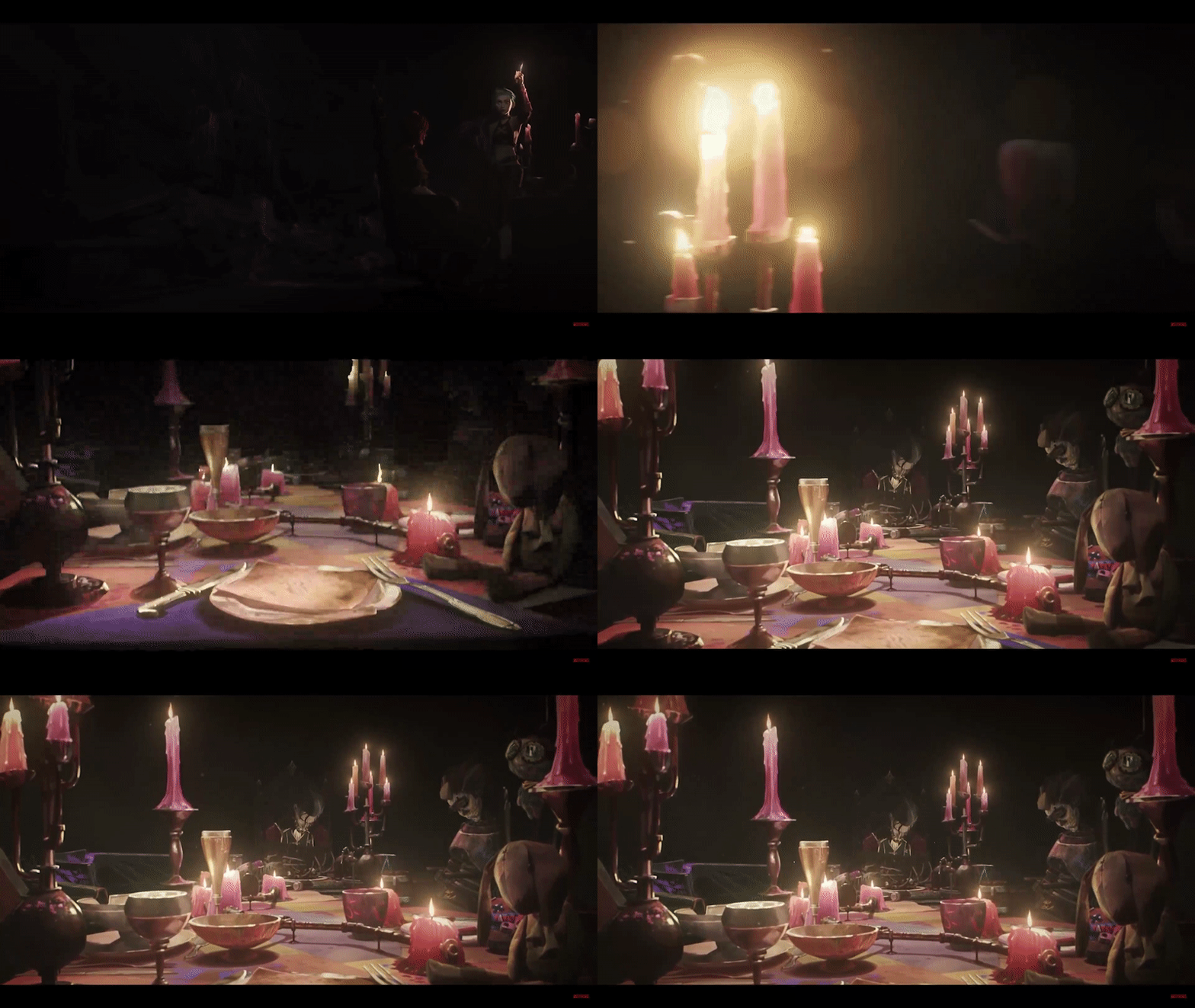
You awaken tied to a chair; your hands visibly bound to the wooden arms. You hear far away footsteps slowly approach, as your eyesight clears you see the scene before you. A grotesque tea party, mannequins smiling blankly, whispers of warning build in momentum as the footsteps grow closer. You feverishly work at your bonds, finally breaking free as you hear a creaking from behind. The door has opened, and your host has arrived.
I wanted to create a dark scene for my environment as I always thought the Alice in Wonderland story to be unsettling in that way only old children’s tales seemed to be able to manage. Plus, by creating a dark and unsettling environment you limit the need for lots of different assets as the viewer wont be expected to inspect the scene as much as they would if it was a high key light scene.
:: Modelling ::
I tried to limit the number of unique assets the scene called for, this was to both speed up the production process and not to fill the scene with so many assets the viewer can’t be effectively directed where to look in the scene.
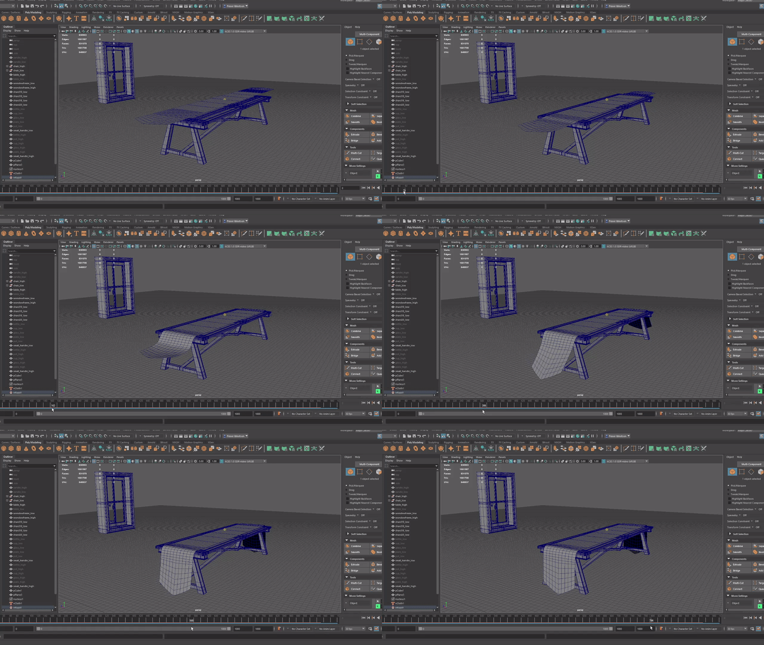
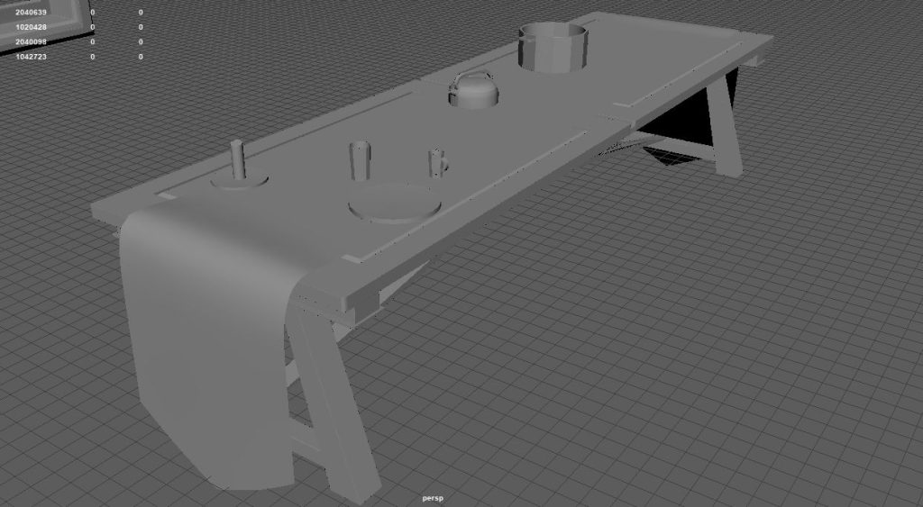
Most of the assets needed were fairly ordinary, such as a table and chair. Though I did want to add a table cloth to the table (Fig.18) which will help add pageantry to the image and fit with the scenario described. Likewise I wanted to make sure to have enough small assets to make the table top seem sufficiently cluttered (fig.19).
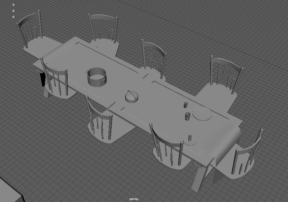
It was here I started to wonder how I would add people into the scene. My initial plan was to create stuffed mannequins, like scarecrows and have them be sat in the seats. (fig.20) but I also thought it would be nice to salvage parts of the previous environment I had been working on, so perhaps statues instead of stuffed dolls?
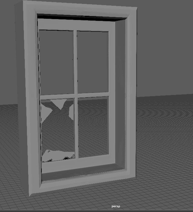
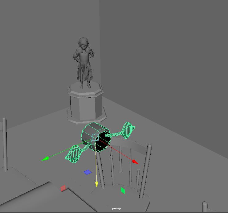
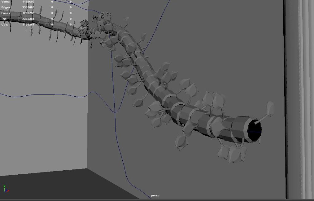
I planned to have the walls be covered in various vines, as though the room has been overtaken by nature. But I thought it important to break up the otherwise blank walls with something like a window (Fig.21). Speaking of vines, I decided that my scene wasn’t going to include animations of the vines growing, and as such I could be a little more ambitious with the modelling of them. To do this I removed the outside faces of the vine segments (fig.22) and then stitched the vertexes together once they had been applied to a MASH shape (Fig.23). By stitching these segments into one continuous line it gives for a nicer high poly shape, and therefor a better bake when texturing.
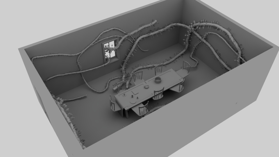
Here you can see what the model of the environment looked like before texturing (Fig.24). I think the vines really add to the scene and by having them grow through the window you create a nice visual which I think will be interesting enough for a viewer to explore using VR.
:: Texturing & Importing to UE5 ::
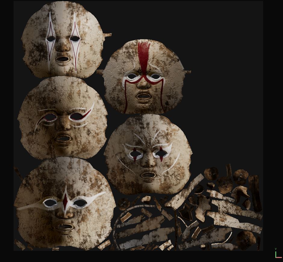
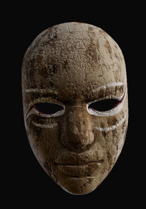
Next, I turned my attention to populating the scene. As mentioned, my original plan with this scenario was stuffed dolls, however I wanted to pay homage to the first environment I was making which would have been using statues instead of dolls. I used DAZ to create different poses for the standard female mannequin, (female because the Alice in Wonderland story is all about women’s role in society at the time) And then duplicated and manipulated the faces of those models to create masks (Fig. 25)
I originally wanted to create smiley face masks, to show the idea of women’s frustrations at the time where they were expected to smile and act docile despite mountain frustrations with society. However, I found myself unable to create symmetrical hand drawn textures, such as smiley lips. So instead pivoted to create various mask with the intent to give the impression of circus performer costumes (Fig.26)
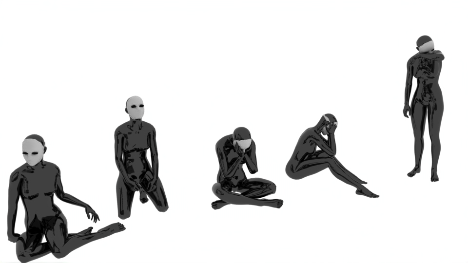
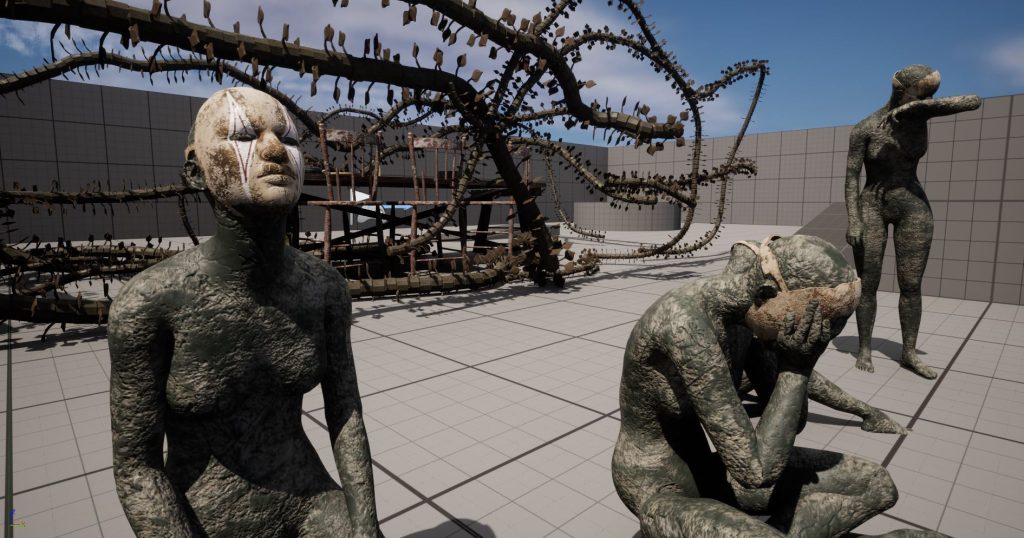
I really like how the figures turned out for the project, I think the statue aesthetic works well and while they wont be sat in the seats as I originally intended I think they would really add interest to the scene. That’s why I changed my idea, making the figures very much the focal point of the video I would create.
Instead of being kidnapped in the physical sense I would instead explore the dreamlike quality of Wonderland, which both allows me to add a ‘down the rabbit hole’ type effect and means I am less restrained by physicality’s that could call for the implementation of things like animation.
:: Lighting the Scene ::
I decided to create my environment in Unreal Engine, this is partly due to the issues I found when test rendering using Arnold previously (see my Evaluating Ideas post) and also because I am able to create much more atmospheric lighting in Unreal than I can using Maya.
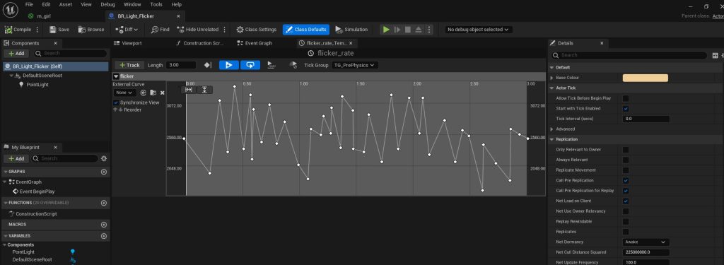
I temporarily placed plain white lighting, just so I can see where I was placing assets (fig.29), then I created a blueprint node that dimmed and brightened a point light to create a flickering light effect (fig.30), this did take more time than I expected, as when you search for how to do this the tutorials you are presented with are more for a light which switches on and off, rather than just dimming and brightening like a flame flicker.
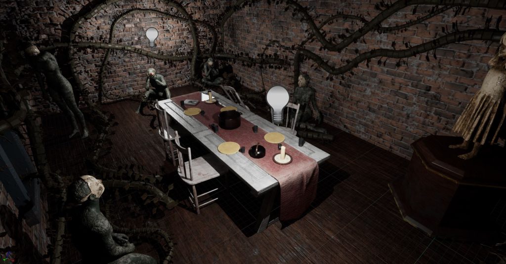
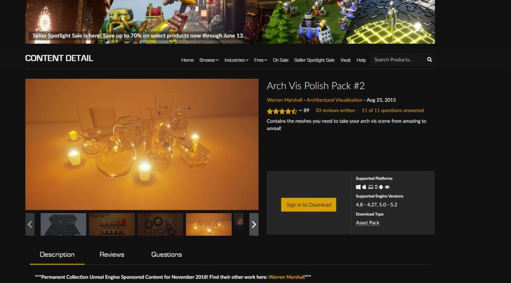
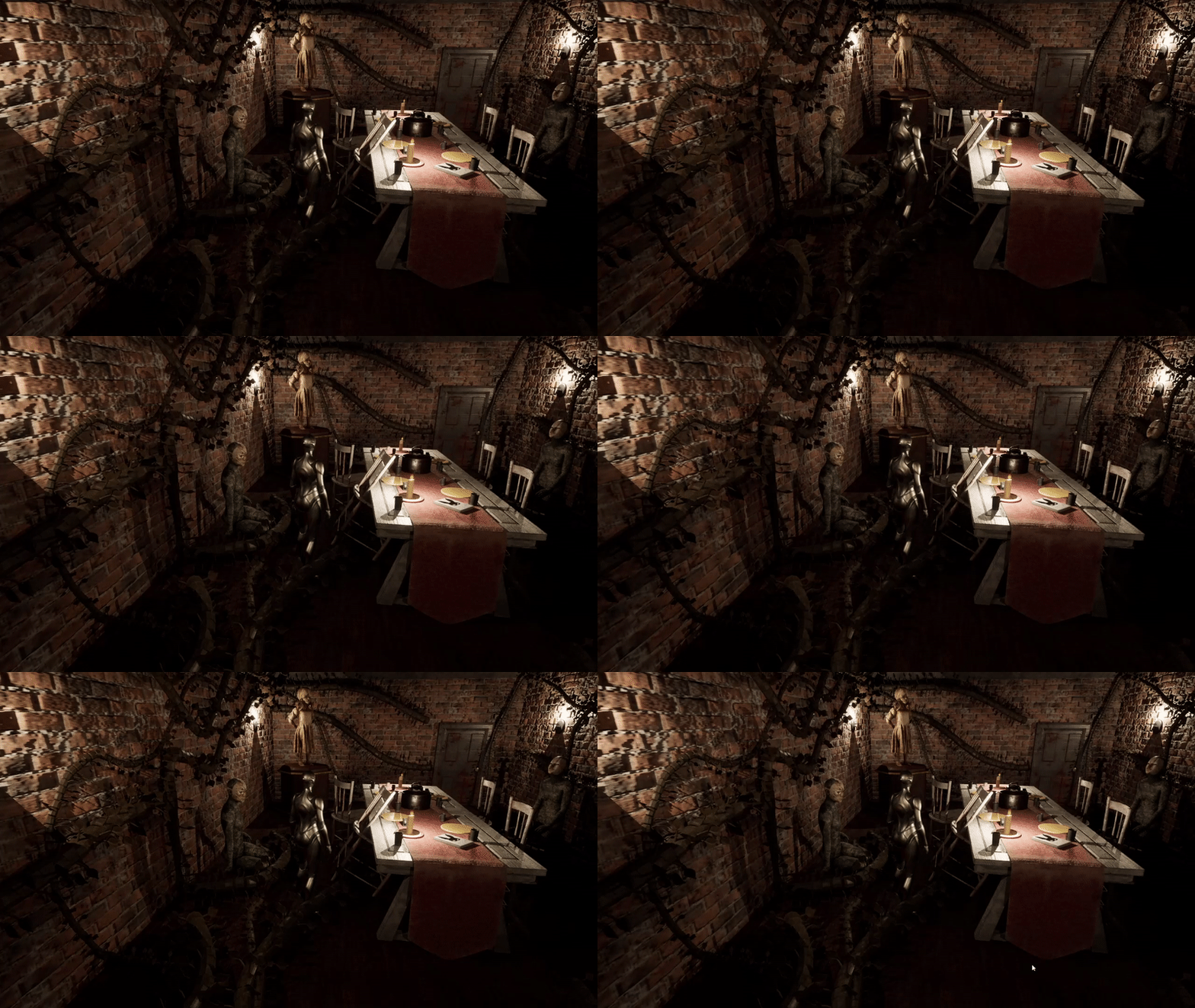
I did use an asset pack, just for the flickering flame sprite visual effect (Marshall, W, 2015) which I then paired with the flickering light blueprint I had created, giving a nice effect on the walls and casting dynamic shadows (Fig.31). If I had more time, I would have liked to duplicate this light blueprint multiple times and randomise the amount of brightening and dimming, in order to make it seem more like there are many different flames rather than all dimming and brightening together. But this is a fairly small thing and I am happy with the overall look of the environment.
::Summary ::
In this post I have broken down the modelling process of the environment I created. Also showing how the development process changed from one idea to another and then how that second scenario was further changed. My next posts will discuss the technical demands presented by creating VR within Unreal Engine.
:: References ::
Atlus (2016) ‘Persona 5’ [Video Game] Available online: https://store.steampowered.com/app/1687950/Persona_5_Royal/ [Accessed 20/05/2023]
Be free (n.d.) ‘It looks a lot like Christmas. Christmas party girl drop curtsy. Little kid with festive look. Happy child celebrate Christmas and new year. Christmas eve. Merry xmas. Happy New Year. Holiday season’ [Online Image]. Availible online: https://stock.adobe.com/uk/search/images?k=curtsy&asset_id=309055095 [Accessed 20/05/2023]
CGI Tutorials (2020) ‘How to make a TANK TRACK in Maya quickly. Animated with MASH. 3 steps to get working IN YOUR SCENE’ [YouTube Video] Available online: https://www.youtube.com/watch?v=R6WBrG1Pocw&ab_channel=CGITutorials [Accessed 20/05/2023]
FlippedNormals (2021) ‘The Fastest Way to Sculpt Characters in 3D’ [YouTube Video] Available online: https://www.youtube.com/watch?v=Oab3268dGC8&ab_channel=FlippedNormals [Accessed 20/05/2023]
Marvelous Designer (2020) ‘9.5 Marvelous Designer Skirts: Circle Skirt’ [YouTube Video] Available online: https://www.youtube.com/watch?v=3OhPqYB7aSY&ab_channel=MarvelousDesigner [Accessed 05/06/2023]
Pixel Fondoue (2020). ‘Marvelous Designer | Arrangement Points’ [YouTube Video] Available online: https://www.youtube.com/watch?v=CmZMhn9vCoA&ab_channel=PixelFondue [accessed 05/06/2023]
Steven David (2020) ‘Getting Started With Daz3d Part 1 | Creating Your First Character with Daz3d’ [YouTube Video] Available online: https://www.youtube.com/watch?v=jrZv_Tjpzg0&list=PLOHbtCoK2PNKquZ8AEoXKefUyiF01wJ3w&ab_channel=StevenDavid [Accessed 20/05/2023]
The Monster You Created (2021) ‘Arcane’ Season 1, Episode 9. Directed by Pascal Charrue & Arnaud Delord. Written by Christian Linke and Alex Yee. [TV Programme] Netflix. 7 November 2021.
The WP Guru (2021) ‘Making a quick shirt in Marvelous Designer and importing it into DAZ Studio – 3D Shenanigans #3.21’ [YouTube Video] Available online: https://www.youtube.com/watch?v=-R1WQ4jOWb8&ab_channel=TheWPGuru [Accessed 19/06/2023]
Warren Marshall – Architectural Visualization (2015). ‘Arch Vis Polish Pack #2’. [VFX Asset Pack] Available online: https://www.unrealengine.com/marketplace/en-US/product/arch-vis-polish-pack-01 [Accessed 07/06/2023]