:: Research ::
For this week’s task we had to incorporate the theme of 10 seconds somewhere in our idea. This much last week was a difficult theme, particularly given the very short timeframe I had to create my idea. Many of the ideas shown were for video games, which was not something I wanted to do in this module for the reasons outlined in my ‘Prototype 2’ post.
I did have an idea where I would make a kind of mystery app where the player is only allowed to hear storylines 10 seconds at a time and had to piece together the mystery. However this was far to loose and idea and would take far more than one week for me to make the idea into a solid prototype.
:: Idea Development ::
Eventually I focused on an idea to use the 10 second requirement to show elevator pitches. I thought back to apps such as ‘Tik Tok’ and ‘Vine’ (ref.1,2), the latter of which only allowed users to upload videos 6 seconds in length. I thought I could make an app which allowed for users to upload 10 second pitch videos I could then create a very quick and easy way of investing in new business ideas.

Ref.1 
Ref.2 
Ref.3
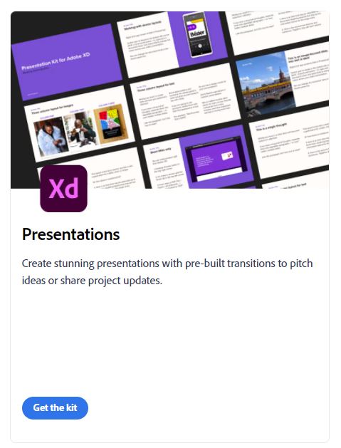
Now, using a UI kit really helped me last week, not just in creating a unified look but also giving me ideas for slides on the app I wouldn’t otherwise have thought off. Because of this I thought it would be helpful to find another UI kit for this pitch (Ref.3). This was helpful in a way, however unlike last weeks prototype the slides provided by the kit didn’t give me any ideas about how to construct the app. I did manage to integrate the slides given by the kit, but this did make creating the portfolio take a lot longer than I would have liked.
:: Production ::
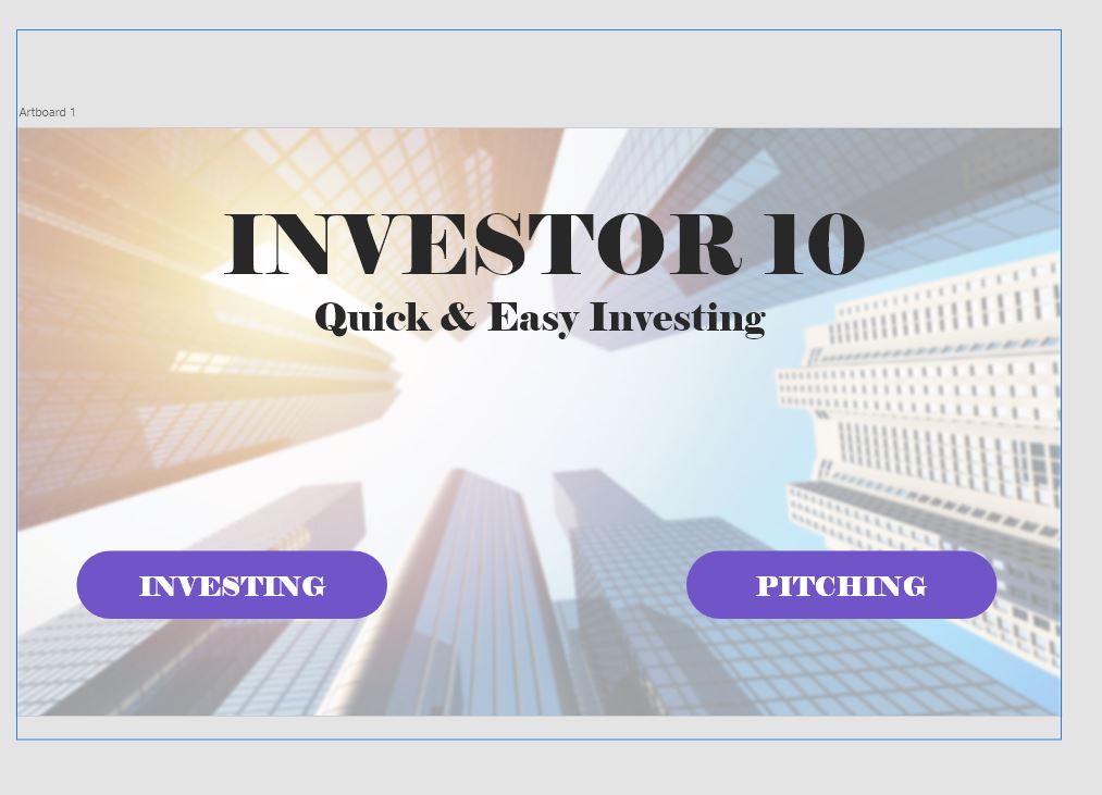
First I created the starting screen, which like in my first week I made in photoshop and then imported into Adobe (fig.1). I thought it would be nice to have two different paths that intersect with each other as I did a little of this in my second prototype and wanted to expand on that. I also decided here that I was going to use a web template for my slides as I had used my phone screen slides the last two years and wanted to try a new template. This however was a mistake as the very idea of easily accessible pitch videos I feel lends itself more to being a phone app than a web application.
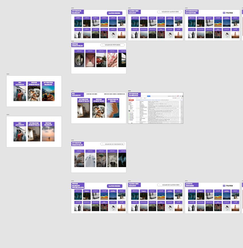
Here you can see the slides that the UI kit I chose gave me (fig.2). I ended up keeping all those slides together and not really touching them as these would all work for giving further information about the pitches the user would have already watched the video of.
You can also see the branching paths I created which mirrored each other but gave two perspectives on the app, one of which would allow for investors to view pitches from people seeking investment and the other for people with a pitch searching for financial backing (Fig.3)
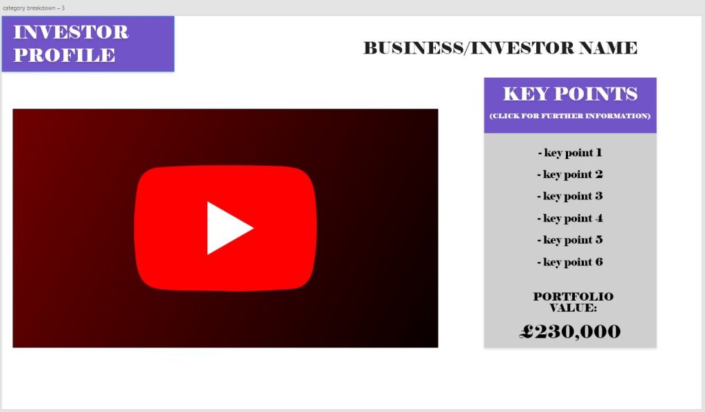
I then made the screen which would host the 10 second video (fig.4) as well as the most important points about whatever pitch is being presented. It was however also important to allow the user to view further detail which would be laid out in whatever way the pitcher or investor wants to design it. (fig.2)
:: Video ::
:: Feedback ::
– My Thoughts –
Before I get feedback from my lecturers, I will briefly go over my thoughts about my prototype. I think I would have benefited by finding a more in-depth UI Kit as much like with the first weeks prototype, I am not really very skilled making professional looking UI elements without this assistance.
I would also say that while I liked using a different template for my canvas sizes the very idea of the app, being quick and easy investing, would have lended itself more to being on mobile then being a web application.
– Chris’s Comments –
Chris’s thoughts mirrored my own in regards to the UI design, but both Chris and Stuart seemed largely positive about the idea and didn’t seem to find any glaring issues that would require improvement.
:: References ::
Adobe XD UI Kit. ‘Presentations’. Available online: https://www.adobe.com/uk/products/xd/features/ui-kits.html [Accessed 20/03/2022]


