:: Blockout Response ::
I wasn’t really happy with what I had produced for my blockout, (Which you can see in my ‘Blockout Post’). So there would be a lot of work to change what I had attempted with the blockout. There were some elements I wanted to carry over into my final level, such as the hub and spoke design for the level which I felt gave a nice open feeling to the map.
I also wanted to make sure I add the notes I wanted to use in the blockout in my final level, and try to breathe more life into my map with more experimental trigger box implementation, such as having objects move when the player hits certain trigger boxes. Stuart mentioned that my blockout felt very static and I hope this will alleviate that.
:: Development Diary ::
::My Plan ::
There were a lot of changes I wanted to make to my level following the production of my blockout. These ranged from tidying up my blueprints to changing the paths I had created previously. I wanted to include more height in my level, as with the blockout other than the raise of the final path none of the others felt like they used height when playing.
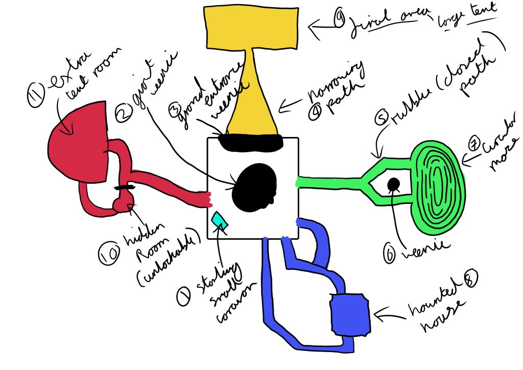
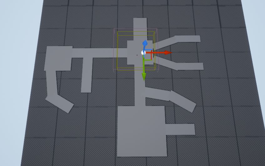
I also wanted to edit the paths I had used previously as I felt they were a little to grid like for my liking (Fig.1). To change this, I wanted to include some measure of player choice at the start of paths by giving them multiple options, even if the various paths would later lead to just one route so I can direct the player (Fig.2).
I very much wanted to keep the hub and spoke design of my original map, as this allows me to direct the player and create a cohesive map. Which was discussed nicely in the GDC talk ‘The Level Design of Gone Home’ (GDC,2015).
:: Landscaping ::
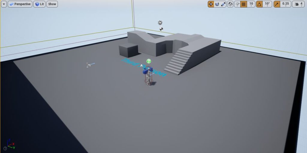
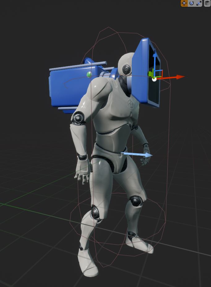
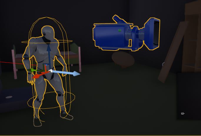
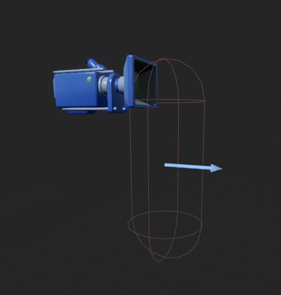
The first step to designing my level was to create the landscaping. I chose to go with a 3d person template as this would mean I wouldn’t have to add things like sphere atmospheres like I did in the blockout previously (Fig.3). I did however have to move the camera forward with the character actor so as to create a fixed first-person game from the third person template (Fig.4) I also found that a lot of the tutorials on Canvas were for a third person game, so by using the third person template these tutorials would require less editing for me to implement.
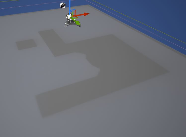
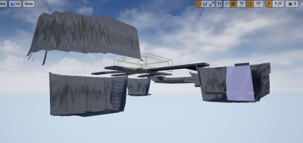
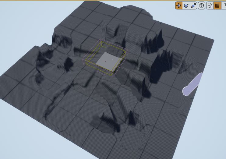
I did have a slight problem with the starting assets as when I deleted the walls and objects they left behind their shadow. I wanted to keep the starting square as I was planning to make the starting area a car park and the starting square would help me keep a track of the scale. Which I had got wrong with the blockout and had to increase the size of the player character to compensate. (Fig.5)
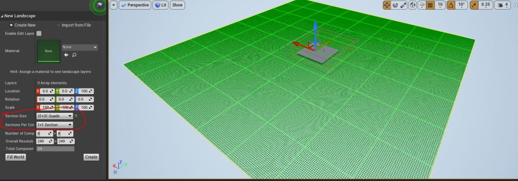
My blockout level was also too large for my liking. Most walking simulators take place in small, or dense areas. Such as house in ‘Gone Home’ (Fullbright, 2013) or a small industrial area such as in ‘Dr. Langeskov, The Tiger, and The Terribly Cursed Emerald: A Whirlwind Heist.’ (Crows,Crows,Crows. 2015). This means that the player doesn’t get bored simply walking in one direction, which I felt they would in my blockout. So, when I was creating the sheet to sculpt a landscape from I made sure to scale down on the original. To just 31 x 31 quads. This meant I could compact the game to make a shorter run time and reduce player fatigue or boredom.
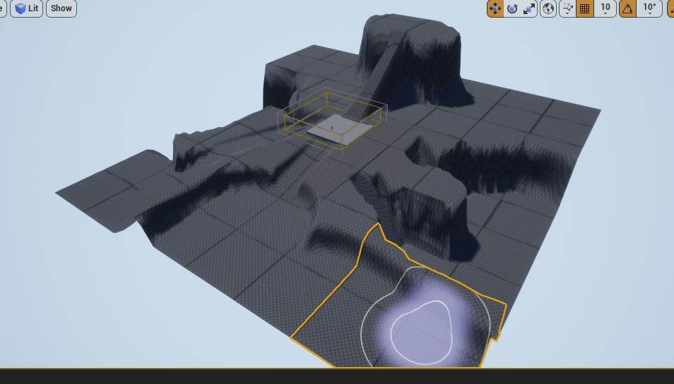
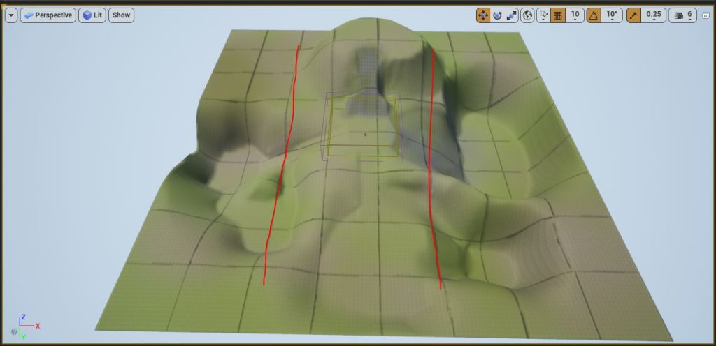
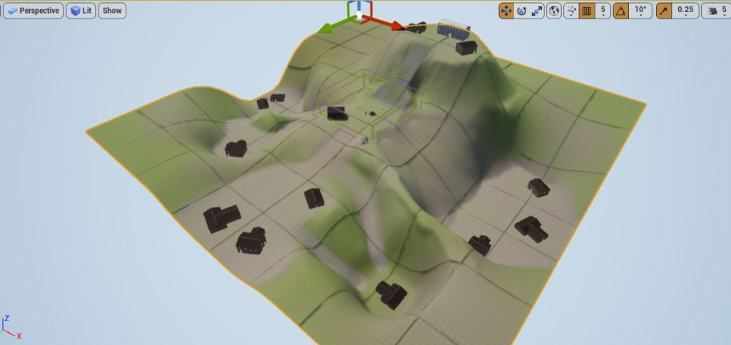
With the sheet in place, I could start using the various landscaping brushes, however originally, I made a mistake with the brushes. I sculpted and flattened to the various heights I wanted for the paths and then used ramps to connect the various heights. However, this meant that I couldn’t have the winding paths I laid out in my plan (Fig.2). This meant that the paths still had a very grid based shape to them which I didn’t like (Fig.7)
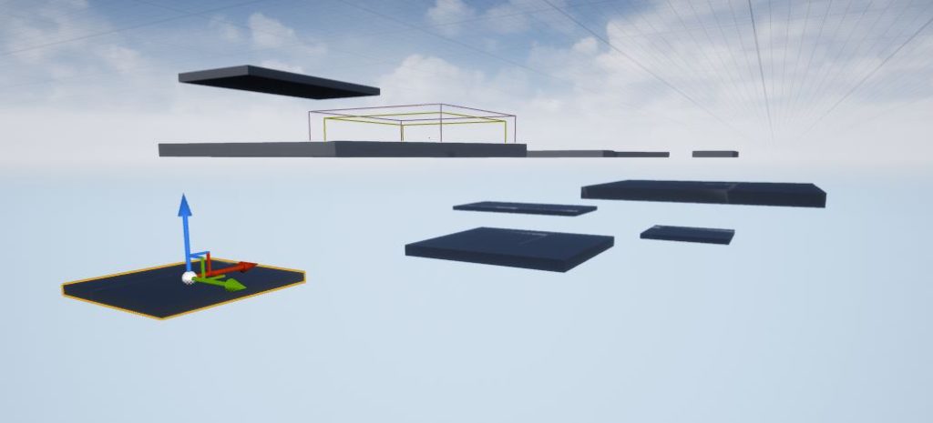
To make the paths seem more natural I decided not to use the static mesh cube paths. I deleted the paths I had already made (Fig.8) and instead simply moved the squares where I would place my assets later at varying heights (Fig.9). Then I could use the sculpting tool to make holes to the heights I wanted (Fig.10). Then I could create ramps before using the other landscaping tools to forge more natural swooping paths from these ramps (Fig.11)
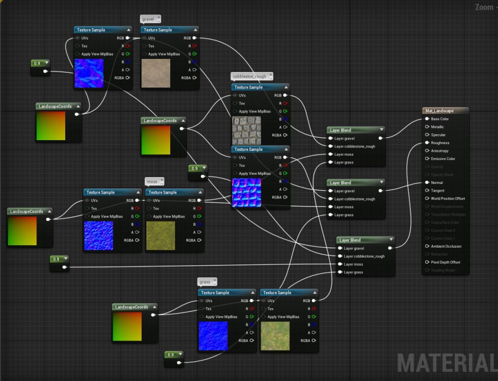
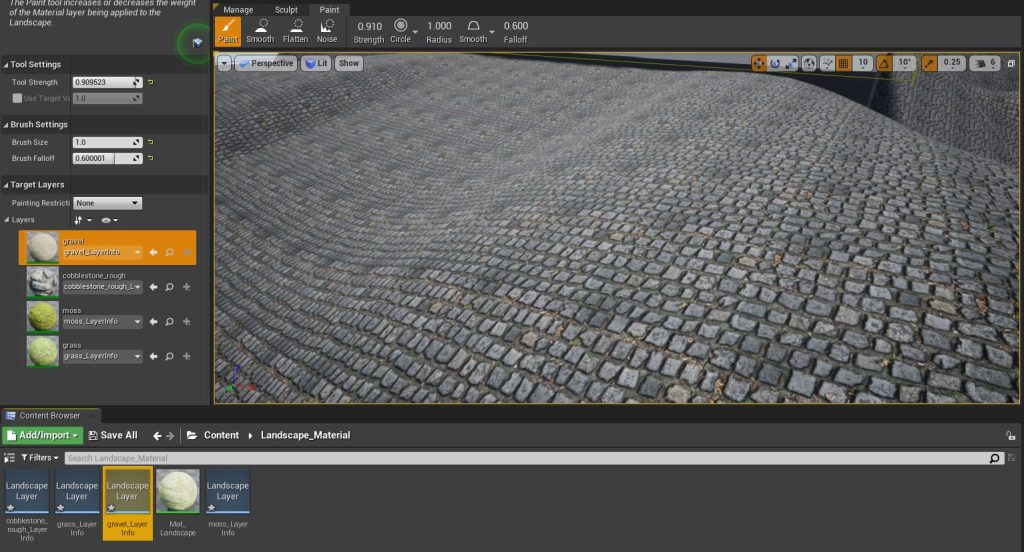
With my map now in place I could turn my attention to texturing the landscape. This was another point where using a template level helped as I could use a few of the starter content textures to paint my landscape (Fig.12). I did find a problem here as I thought by adding multiple textures together they would blend onto each other like they did on the preview sphere however this was not the case and so I had to pick one texture to paint the entire landscape (Fig.13) and then delicately paint other textures on top to give a realistic abandoned ground look.
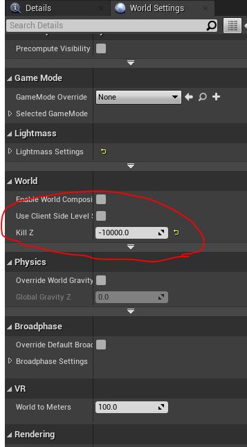
I did also find an issue when playtesting the level in that when going down the paths the game would freeze. This ended up being caused due to the world setting of the third person template deleting the character when the player goes to far down the Z axis, which would freeze the game. This is designed to stop the player falling forever should they fall through the map and simply needed setting far lower so that the player doesn’t approach the deletion point on the Z Axis (Fig.15)
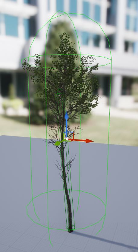
I did begin adding foliage from an asset pack, which I was adding collision to (Fig.16), however I found that when adding the foliage my computer system would really slow down its performance. Now I don’t know if this is a problem with the mesh of the trees from the asset pack or just something wrong with my machine but it made me think that foliage should maybe be the last thing I do before I finish the title. Meaning that it was time to move onto asset creation and placement.
When I finished the asset placement I found that it was in the details panel when in the foliage paintbrush where I needed to add the collision.
:: Asset Placement & Creation ::
Next it came time to populate the scene with assets. To save time I wanted to use as many premade asset packs as possible, so I would only have to create unique assets for the more visible elements of my scene such as the tents and any other assets I have time to make. This meant that for things like trees, which I would use to fill in the blank space between the various paths I would find asset packs to use.
I found a number of different free asset packs, which ended up filling more of the scene than I had originally intended, this was very disappointing for me , but given my time constraints and my understanding that we are not marked on creating our own assets I decided my time would be better invested in my blueprints than in creating my own assets.
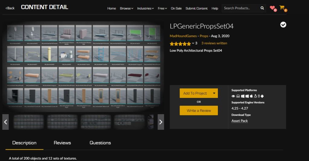
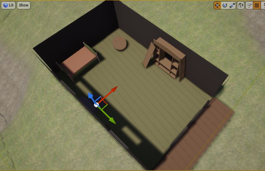
I used the ‘LPGenericPropsSet04’ to create the starting house environment (Mad Hound Games, 2020). I wanted to keep the idea of starting the player off in a small environment before they move through to the larger hub area to create a nice sense of scale (Fig.17).
I also found that I couldn’t find any tent assets in the epic games store, and while I originally intended to make these myself by relying on found assets meant I had to change the story of my level. I decided instead of a carnival or circus environment I would instead use a sort of sunken modern village. This meant I could use more found assets and not make my own, while also adding interest by talking about how the village has been devastated by the landscape sinking into itself, thus allowing me to still use the very large variations in height I wanted (Fig.18).
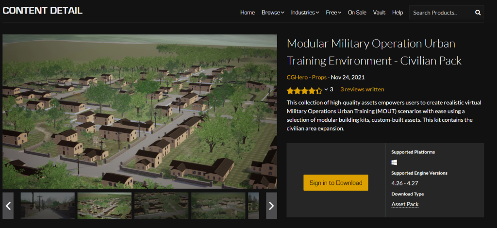
At this point I also found that if I used the same asset pack to create all the various houses in the village that I had for the first I would be sinking a lot of time into placing small modular assets. So I searched for a asset pack which contained complete pre made houses. While this proved surprisingly difficult for me to find I did manage to download the asset pack ‘Modular Military Operation Urban Training Environment – Civilian Pack’ (CG Hero, 2021). Which contained complete house shells, this is the asset pack I used for all but one of the buildings in the village (Fig.18)
I did encounter an issue with the camera at this stage. When entering the various buildings the camera would move in a strange way, separating from the player character for no obvious reason (Fig.19). I didn’t at the time know how to fix this problem, and decided the best workflow was to completely fill the level before playtesting it so decided to leave it for now, but I did know this would need to be fixed before submitting.
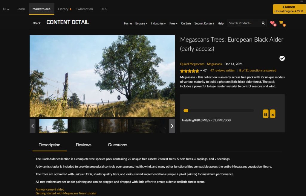
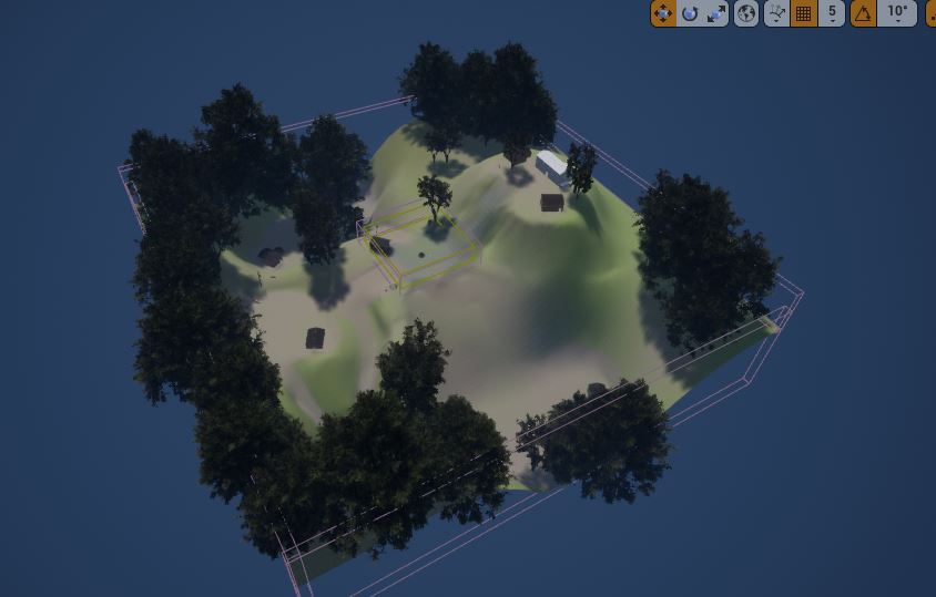
With this in mind I set myself the goal of finishing populating my level quickly. This is the downside to setting my level outside, as a much smaller more controlled level would have been easier to populate with a convincing density of a realistic setting. I used the ‘Megascans Trees: European Black Alder (early access) asset pack previously sourced to give me the thick forest foliage I wanted to fill in the map (Quixel Megascans, 2021).
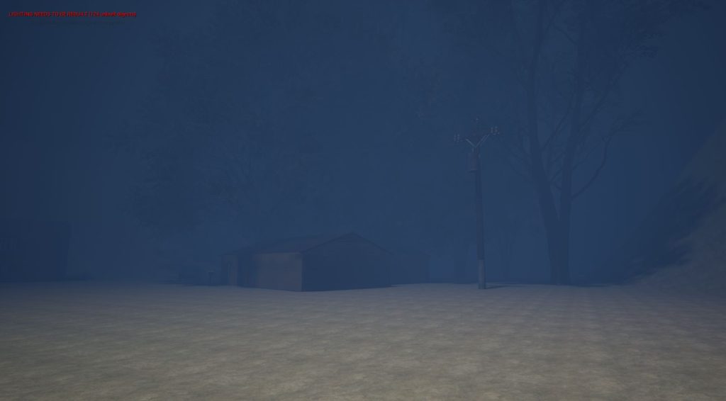
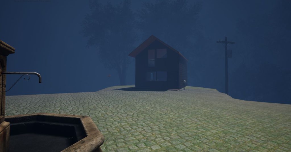
I also added invisible walls around the map to prevent the player from falling off the edge of the world and found tutorials on how to set the sun to a night time environment (MikeTheTech, 2019) and adding a thick fog to try and obscure the way the world map simply ends (Game Dev Academy, 2018). Giving me roughly what the final environment would look like (Fig.20).
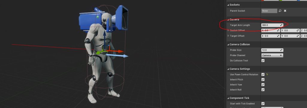
Next, I increased the thickness of my level fog, as when playing the game I found that the fog wasn’t really blocking the player from seeing the edge of the world, which would naturally break any immersion I was able to create (Fig.21). I was also able to figure out the issue I had with the camera when inside of the buildings. The issue was by default the camera has a very long target arm length, which acted as a very long collision box which made the camera move erratically in the confined space of the buildings (Fig.22). Once I shortened this target arm length the camera behaved as expected inside the buildings.
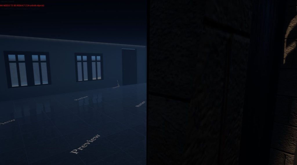
I did have more camera trouble however, as the camera would clip through the walls and doors of my environment, this was because given the slight animation of the default character in unreal editor I had to move the camera in front of the characters face, Which meant the camera could go through walls before the collision of the character actor was recognised (Fig.23).
I also couldn’t just push the camera further back as the player would then see glimpses of the character when looking toward the ends of the screen. I ended up simply turning the character actor invisible (Fig.24). Which fixed the problem but sadly meant that I couldn’t show any feet to the player when walking, something I find helps make a first person game more believable. But, given how I wasn’t altering the standard figure robot feet wouldn’t have fitted the setting anyway, so no great loss.
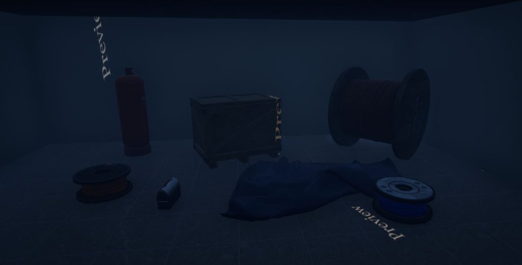
Finally I just had to add set dressing assets to the various buildings to add visual intrigue and fit into the story told through the notes I will be placing later (Fig.25).
:: Blueprints ::
By this stage my idea for the game had morphed into a pretty different game than I originally intended. Instead of a game in the vein of ‘Dr. Langeskov, The Tiger and The Terribly Cursed Emerald: A Whirlwind Heist’ (Crows,Crows,Crows, 2015). I am instead creating a walking simulator title similar to that of ‘Everyone’s gone to the rapture’ (The Chinese Room, 2015).
This meant that rather than having an abundance on single sound trigger boxes to imply a larger world than there really is, like I had done in my blockout. I would be instead focusing more on simple trigger elements and note pages to deliver a less structured, written story where the player can piece together the mystery of the level through non chronological dated note pages.
The first part of my blueprints was to create the path lighting. Now I wanted each of the paths to light up individually in order to guide the player, which I can weave into the narrative of the story with the note pages.
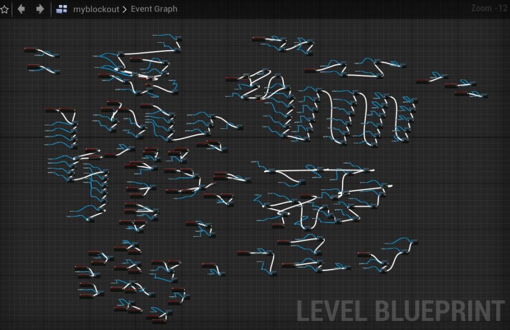
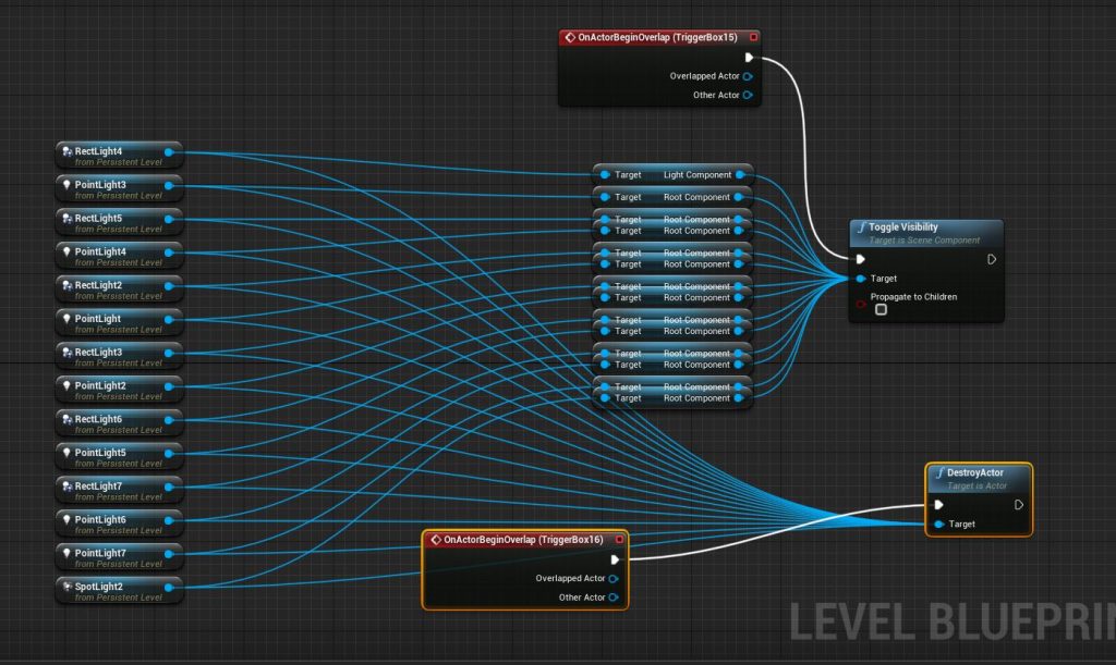
Now, I had a lot of difficulty with the blueprints for the blockout which resulted in a needlessly complicated blueprint map. Most of the blueprint map was taken up by many ‘toggle visibility’ nodes (Fig. 26). So I looked for a way to simplify my blueprint.
I first looked at using arrays with the video below, but couldn’t quite figure out how I could use them to organise the large amount of lights my level required.
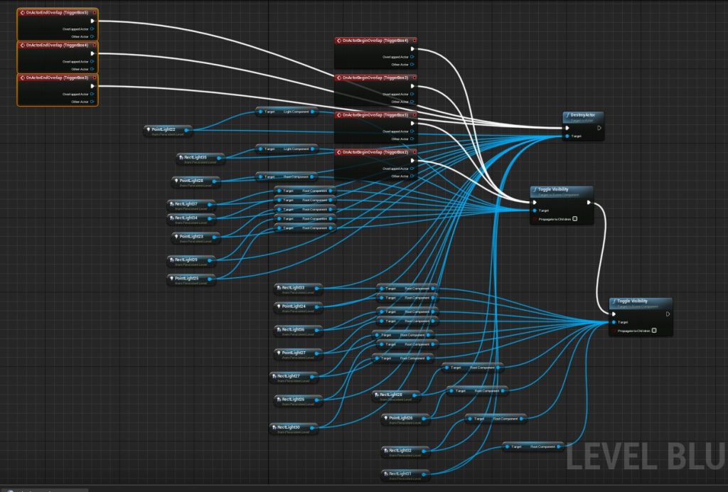
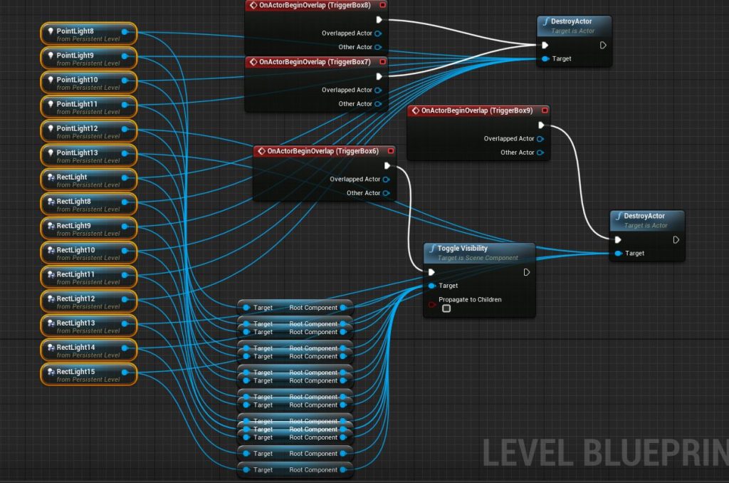
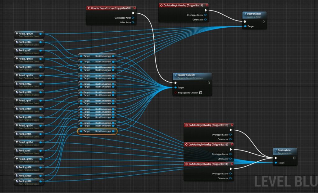
I ended up just playing around with the blueprint nodes to see how many extra points I could eliminate. I also had the issue of the player entering and leaving the trigger boxes at will, as the level is going to be much more free for the player to explore that meant that I didn’t have the same control as the blockout previously. I found the best way was to also place trigger boxes in the houses which would destroy that paths lights. You can see the various paths blueprint groups below (Fig 27, 28, 29 & 30).
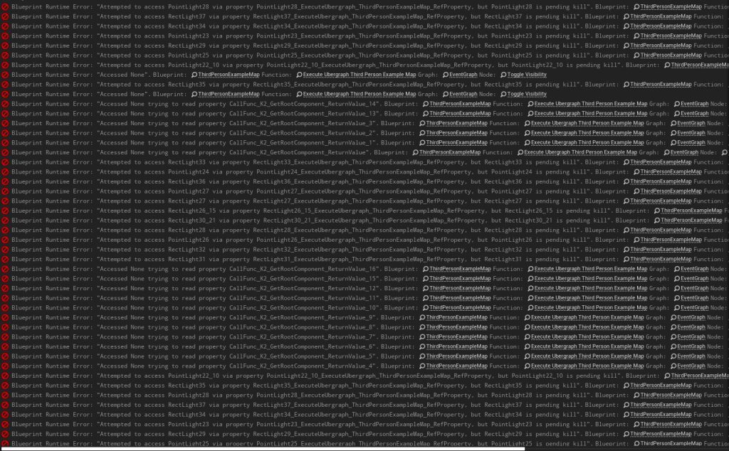
There was an issue with this way of deleting the lights, mostly in that I had a extremely long list of errors once play had ended (Fig. 31). However, these errors were simply to state that part of the blueprint that was being called every time the player would enter a trigger box could no longer be used as the lights had been destroyed, which meant that they weren’t really errors at all and didn’t effect the play in any unintended way.
I have no doubt that my blueprint is not an elegant solution to trying to light many lights and delete many at once, but for my purposes this would do.
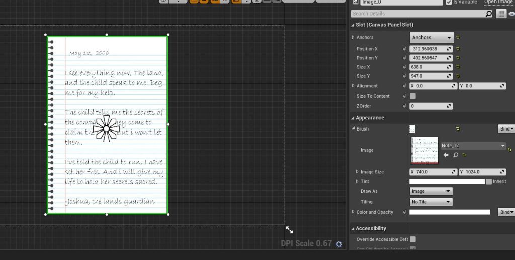
Next, I turned my attention to the notes I needed to place throughout my level, it was very important to make these notes effective as they would be the only source of storytelling and the only objective of the player. I started by finding a nice image of a modern notebook which I could use (PattawIn, n.d.). Then I chose a font which could reasonably be seen as a handwritten note (Fig.32)
I used a canvas tutorial to get the note into the game (Fig.33), but I did wonder if rather than making the blueprint in the level blueprint as the tutorial shows I could instead make a blueprint on the object itself. Which would allow me to simply duplicate the model and change the texture to make the various notes needed without cluttering my level blueprint.
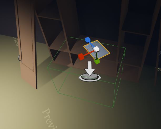
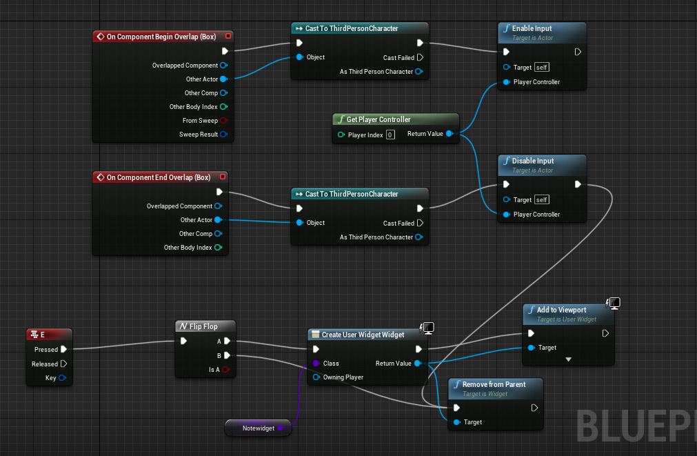
Thankfully after a meeting with Stuart, I was able to create a blueprint that would let the player enlarge the note and remove it by pressing the E key or leaving the trigger box area, I also later made it so the static mesh object would delete itself once the player had closed the widget, making it seem like the player had picked up the notes (Fig.34).
This meant that I simply had to make a widget for each note (Fig.35) and then set the corresponding widget to the blueprint so that the player can read the story through the notes dotted throughout the level.
:: Playtest Response ::
By this stage the game was more or less finished so I could reach out to some contacts for feedback and advice before I start putting the final touches on the game. I wanted to make sure that I got feedback from a gamer and a non gamer, in order to get rounded feedback.
‘I like the atmosphere with the fog and dense trees. But it does feel a little lifeless, perhaps adding some sound effects to liven things up?’
Joshua Green (Non Gamer)
‘There’s nothing to stop the player from going straight to the final building, and the door to that building acts strange when you open it.’
Jessica Moss (Avid Gamer)
:: Responsive action ::
Thanks to my feedback I knew I had to add some kind of reason that the player can’t simply head straight for the final building. I needed to implement a lock and key system for the final buildings door. Which would allow me to place the key on the far end of the map so that the player is forced to explore all the areas of the map if they want to piece together the story told in the notes.
The above video is a good concise tutorial I used to make my blueprints, which thankfully didn’t cause any problems when I followed the steps laid out. I also like the little sound effects for things like picking up the key and trying to open the door without the key.
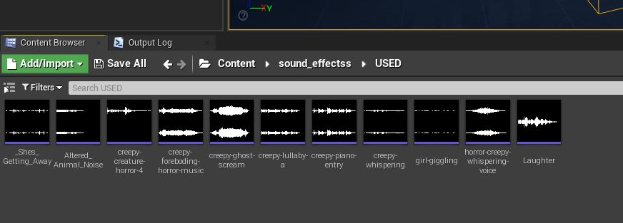
With that in place I could turn my attention to the other feedback and start adding my sound effects. I used many of the same sound effects I had in place in my blockout (Fig.36), (which I have referenced in my blockout post). And, found more sounds to help liven up the feel of the game. I wanted a sound effect for each house the player can enter and another which I would loop for the backing track.
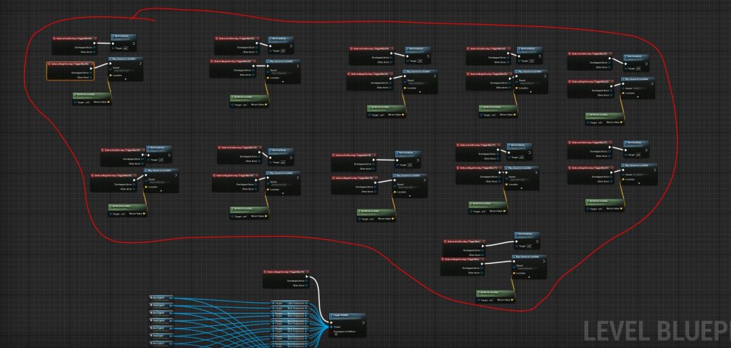
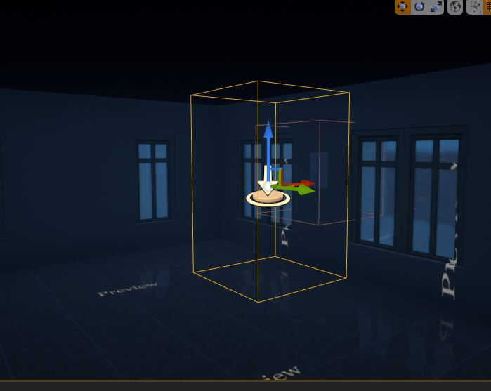
I wasn’t sure what the best way to add the sound cues into my game was, so I ended up just adding trigger boxes which when hit would play the sound and then delete themselves so as not to allow the player to replay the sound (Fig.37). This did mean that I was filling my level blueprint in a fairly cluttered way but I simply didn’t know a better way to do it, and my blueprint was otherwise fairly clean.
Below you can hear all the sound effects I sourced specifically for this level, but as previously said I did also carry over the sounds from the blockout level.
I did also want to just add a couple of quality of life improvements to my game before I exported it. Which included adding a flashlight to the camera so the player could easily see there way inside the buildings, which should hopefully allow them to spot the locations of the notes.
I used the above video to show me how to add a torch, which was very simply but needed me to add a action map to trigger the spot light on and off. With that done I decided I needed something to let the player know when the game is done. I did originally think maybe I could spawn an enemy and have that enemy kill the character upon contact. Like I had in my Unity game last year, however I couldn’t figure out how to do this with blueprints and I was very short on time by this point.
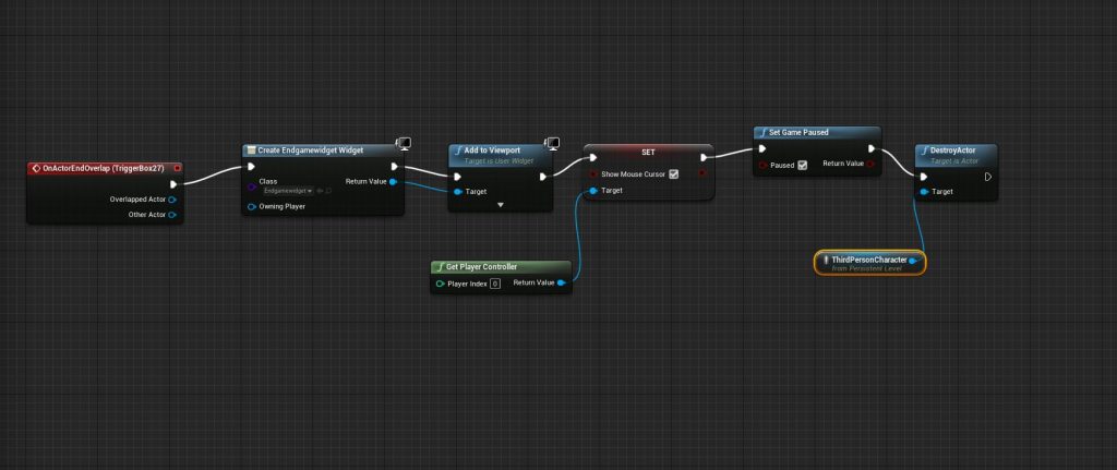
I decided I would add a end screen menu which I wanted to make appear once the player has picked up the final note in the final house(Fig.38). I followed a tutorial which helped me make a perfectly functioning end screen, but for some reason the trigger box didn’t seem to register (Fig.39).
I really couldn’t figure out why my trigger box wouldn’t register, I sent Stuart a message asking for help, and figure that if push comes to shove I can simply export the game with this issues, and simply rely on the player to end play with the end key. Not ideal, as the player would not have a recognisable end to the game without the trigger box working but depending on my time constraints this may be what happens.
In the end I had to separate out the two ways to end the game. The chain to make the end key end the game needed to be placed in the character blueprint as opposed the level blueprint and the trigger box needed to be made into its own blueprint for it to function as intended. I would say the ending feels a little abrupt as it seems to end as soon as the player puts away the final note, but that is still better than having the player not know they have finished the game.
:: Final Thoughts ::
Many things changed with my final level from my original idea. I think this is due to my idea not being really solid when I made my blockout level. This meant that trying to give the player a proper objective proved rather tricky, as I found myself with an environment but no idea what the player should be doing within it.
:: The Bad ::
My main disappointment with my process was not being able to make my own assets. I’m certain that it was the right decision as to try and make even just enough assets to make the environment the originally intended circus would have taken a long time and would have certainly left me unable to get the game complete to the same standard as it is. It does however, meant that I am still not clear on how to take an asset from Maya into Unreal Engine, which was what I was most excited to do when I began the module.
There are things I would change with the level if given more time. Some kind of user interface to let the player know what key picks up the notes, or turns on the torch. Or even a counter to let the player know how many of the twelve notes the have collected would have given a good amount of polish to the final product.
There are things I would change with the level if given more time. Some kind of user interface to let the player know what key picks up the notes, or turns on the torch. Or even a counter to let the player know how many of the twelve notes the have collected would have given a good amount of polish to the final product. Also some visual effects on the notes would have been good to add, if I had it so that the notes pulsed gold then the player would instinctively know to pick them up.
It would also have been good to have either a more visual story to tell, by perhaps showing previous ghostly figures to play out scenes. Or some kind of enemy that would chase the player and give them a sense of urgency, thus not allowing the game to get boring for the player. However both of these were not something I knew how to implement in Unreal Engine 4. And I was more worried about trying to lean how to blueprint professionally. I would rather have a more simply game that runs well then I more ambitious game that might not work. I did try to add in an enemy character, however I could not figure out how to get the character to chase the player and pause while the player read the notes. I’m sure I would have been able to figure this out if given time, but like adding in my own models, I simply didn’t have the time required to do so.
::The Good ::
There are things I do like about my final level however. The extra height does add interest to the gameplay and I do think it was the right decision to make the final path the only one that raises up from the starting hub area. I also think that the lighting does help the player which is good as It meant I didn’t have to incorporate any unsightly navigational UI elements.
I do also feel much more comfortable with unreal engine 4 than I was when I started working on my blokcout level. Through making the various other blueprints for things like the notes and the character I do feel much more able to explore the mechanics of UE4. I much prefer the visual interface of blueprints to the lines of code I struggled to understand in Unity.
I followed the GDC talk at the top of the page which discusses how to successfully direct the player even in an open world environment (GDC, 2015), and I do think that I was able to give the player direction well. I also think that the level does have a good atmosphere and does hint that there is more going on in the game world than the player can see, which helps make the story told through the notes more engaging.
:: References ::
Audio_Dread (2020) ‘Creepy Foreboding Horror Music‘ [Freesound.org]. Available online: https://freesound.org/people/Audio_Dread/sounds/534506/ [Accessed 26/01/2022]
Audio_Dread (B) (2020) ‘Creepy Creature Horror 4‘ [Freesound.org]. Available online: https://freesound.org/people/Audio_Dread/sounds/528508/ [Accessed 26/01/2022]
CGHero (2021). ‘Modular Military Operation Urban Training Environment – Civilian Pack’. [Epic Games Store Asset Pack]. Available online: https://www.unrealengine.com/marketplace/en-US/product/modular-military-operation-urban-training-environment-civilian-pack [Accessed 11/01/2022]
Crows,Crows,Crows (2015). ‘Dr. Langeskov, The Tiger and The Terribly Cursed Emerald: A Whirlwind Hiest’ [Video Game]. Available online: https://store.steampowered.com/app/409160/Dr_Langeskov_The_Tiger_and_The_Terribly_Cursed_Emerald_A_Whirlwind_Heist/ [Accessed 02/01/2022]
Deela (2004) ‘lock a door.wav‘ [Freesound.org] Available online: https://freesound.org/people/Deela/sounds/487614/ [Accessed 26/01/2022]
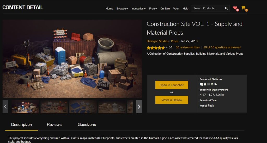
Dekogon Studios (A) (2018). ‘Construction Site VOL. 1 – Supply and Material Props’. [Epic Games Store Asset Pack]. Available online: https://www.unrealengine.com/marketplace/en-US/product/construction-site-vol-1-supply-and-material-props [Accessed 19/01/2022]
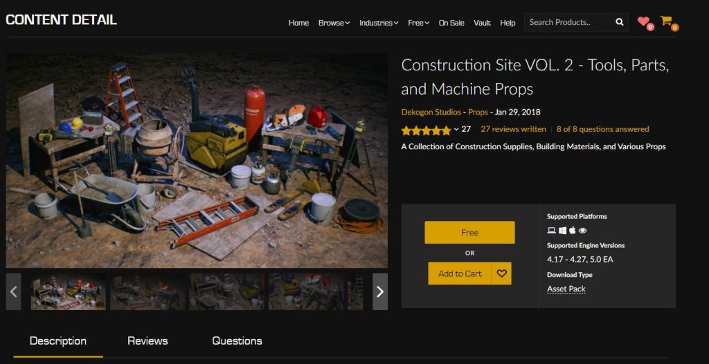
Dekogon Studios (B) (2018). ‘Construction Site VOL. 2 – Tools, Parts, and Machine Props’. [Epic Games Store Asset Pack]. Available online: https://www.unrealengine.com/marketplace/en-US/product/construction-site-vol-2-tools-parts-and-machine-props [Accessed 19/01/2022]
DevSquad (2018) ‘Introduction To Arrays – #25 Unreal Engine 4 Blueprints Tutorial Series’. [YouTube Video] Available online: https://www.youtube.com/watch?v=7lNzjbpQPmk&ab_channel=DevSquad [Accessed 01/01/2022]
epicdude959 (2016) ‘Creepy Ghost Scream‘ [Freesound.org]. Available online: https://freesound.org/people/epicdude959/sounds/352508/ [Accessed 26/01/2022]
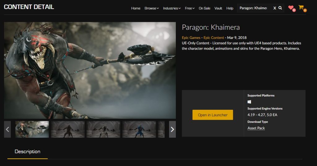
Epic Games (2018). ‘Paragon: Khaimera’ [Epic Games Store Asset Pack]. Available online: https://www.unrealengine.com/marketplace/en-US/product/paragon-khaimera [Accessed 24/01/2022]
Fullbright (2013). ‘Gone Home’ [Video Game]. Available online: https://store.steampowered.com/app/232430/Gone_Home/ [Accessed 02/01/2022]
Game Dev Academy (2018). ’38 Adding Fog to a Level in UE4 | Unreal Engine 4 Tutorial for Beginners‘. [YouTube Video]. Available online: https://www.youtube.com/watch?v=v2dIb2b6qew&ab_channel=GameDevAcademy [Accessed 16/01/2022]
GDC (2015) ‘The Level Design Of Gone Home’ [YouTube Video]. Available online: https://www.youtube.com/watch?v=n6__ftHSEfM&ab_channel=GDC [Accessed 16/01/2022]
giddster (2017) ‘Creepy singing‘ [Freesound.org]. Available online: https://freesound.org/people/giddster/sounds/394931/ [Accessed 26/01/2022]
InspectorJ (2017) ‘Creepy Lullaby, A.wav‘ [Freesound.org]. Available online: https://freesound.org/people/InspectorJ/sounds/412224/ [Accessed 26/01/2022]
MadHoundGames (2020). ‘LPGenericPropsSet04’. [Epic Games Store Asset Pack]. Available online: https://www.unrealengine.com/marketplace/en-US/product/lpgenericpropsset04 [Accessed 11/01/2022]
Matt Aspland (A) (2021). ‘How To Open A Locked Door With A Key – Unreal Engine 4 Tutorial’ [YouTube Video]. Available online: https://www.youtube.com/watch?v=29–ieorX7Q&ab_channel=MattAspland [Accessed 26/01/2022]
Matt Aspland (B) (2020) ‘How To Make A Game Over Screen – Unreal Engine 4 Tutorial‘ [YouTube Video]. available online: https://www.youtube.com/watch?v=EjH-i-NoYAk&ab_channel=MattAspland [Accessed 27/01/2022]
MikeTheTech (2019). ‘Unable to change ‘Sun Height’ in Unreal Engine 4? Here’s how!‘. [YouTube Video] Available online: https://www.youtube.com/watch?v=lRUAk6AxjHU&ab_channel=MikeTheTech. [Accessed 16/01/2022]
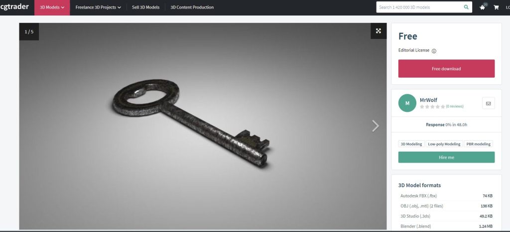
Mr.Wolf (2015). [CGTrader.com] ‘Worn Key low-poly 3d model’ (3D Model). Available online: https://www.cgtrader.com/free-3d-models/household/other/worn-key-730dba2058ea7346f8855d825410d1c7 [Accessed 26/01/2022]
MZONE3D (2018). ‘UE4 Flashlight Torch‘ [YouTube Video]. Available online: https://www.youtube.com/watch?v=yAnH_Yp7GRM&ab_channel=MZONE3D [Accessed 27/01/2022]
niamhd00145229 (2018) ‘inspect item.wav‘ [Freesound.org] Available online: https://freesound.org/people/niamhd00145229/sounds/422709/ [Accessed 26/01/2022]
pattawin (n.d.). freepik.com (Online Image). Available online: https://www.freepik.com/premium-vector/blank-lined-paper-template_2525009.htm?epik=dj0yJnU9UWdhQ2c5cTdpYzdqWjdhaHZuY3FDRUtPbFFDczRRcVEmcD0wJm49bmpEZGlNSlducHpBVVpuLU04bkVlUSZ0PUFBQUFBR0hxMERr (Accessed 21/01/2022]
Quixel Megascans (2021). ‘Megascans Trees: European Black Alder (early access)’. [Epic Games Store Asset Pack]. Available online: https://marketplace-website-node-launcher-prod.ol.epicgames.com/ue/marketplace/en-US/content-cat/assets/megascans [Accessed 01/01/2022]
StudioOneThirtyOne (2021) ‘creepy-piano-entry.wav‘. [Freesounds.org]. Available online: https://freesound.org/people/StudioOneThirtyOne/sounds/552481/ [Accessed 26/01/2022]
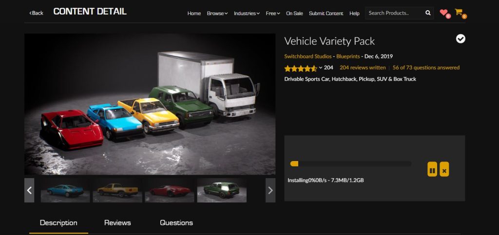
Switchboard Studios (2019). ‘Vehicle Variety Pack’. [Epic Games Store Asset Pack]. Available online: https://www.unrealengine.com/marketplace/en-US/product/bbcb90a03f844edbb20c8b89ee16ea32 [Accessed 11/01/2022]
The Chinese Room, (2015). ‘Everyone’s Gone to the Rapture.’ [Video Game]. Available online: https://store.steampowered.com/app/417880/Everybodys_Gone_to_the_Rapture/ [Accessed 17/01/2022]
