*Disclaimer*. The assignment brief states I need 200 dpi tiff files. I cannot find a method to achieve this in the render setting in maya. These are 200 ppi tiff files, I have spoken with one of the lecturers and believe these should be high quality enough to fulfil the criteria.
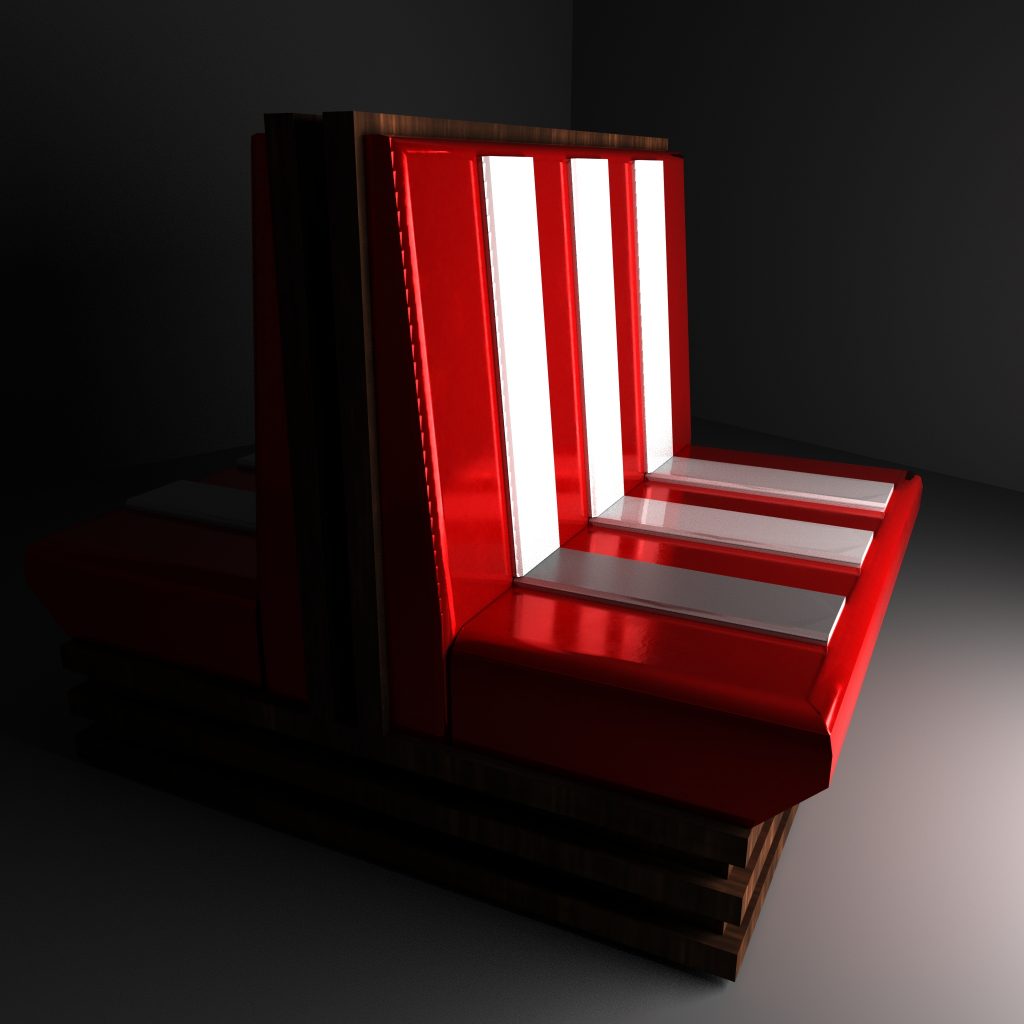
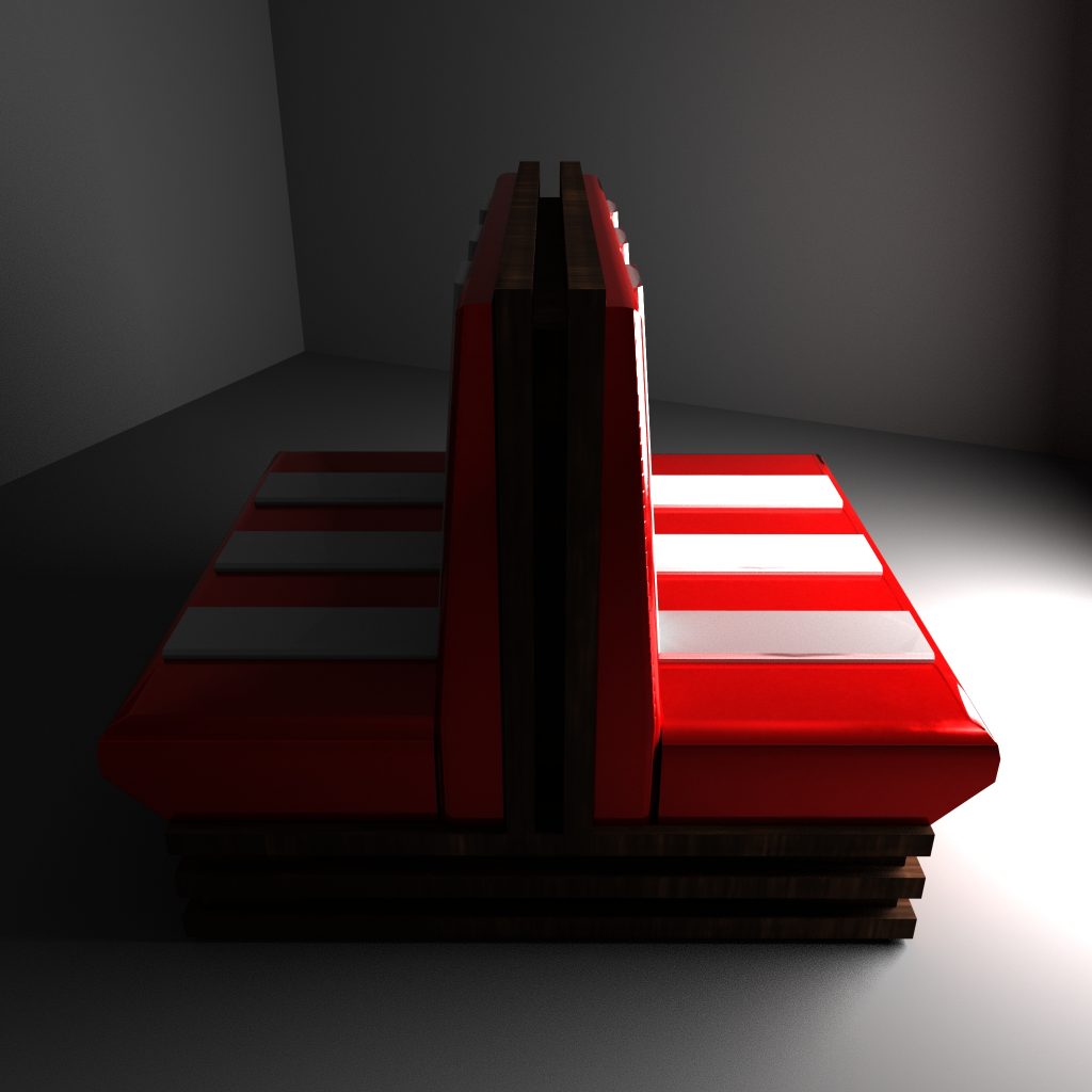
Booth Seat
I used red and white for the colour scheme of my booth seat model, which would help tie it in with the stool and ceiling light. I also used a wood texture similar to that which I would later use with the TV to help link the two. With such a simple model there’s not many places to go wrong once modelled, I am annoyed I couldn’t export my cushion into substance however am still happy with the result.
Overall, I would say I am happy with this model, it certainly wouldn’t be the centre piece of the assets I have made, but is a nice simple design that looks like it would have actually been produced in the 1950’s. The baking worked well with the exception of the cushion, and the colours work well.
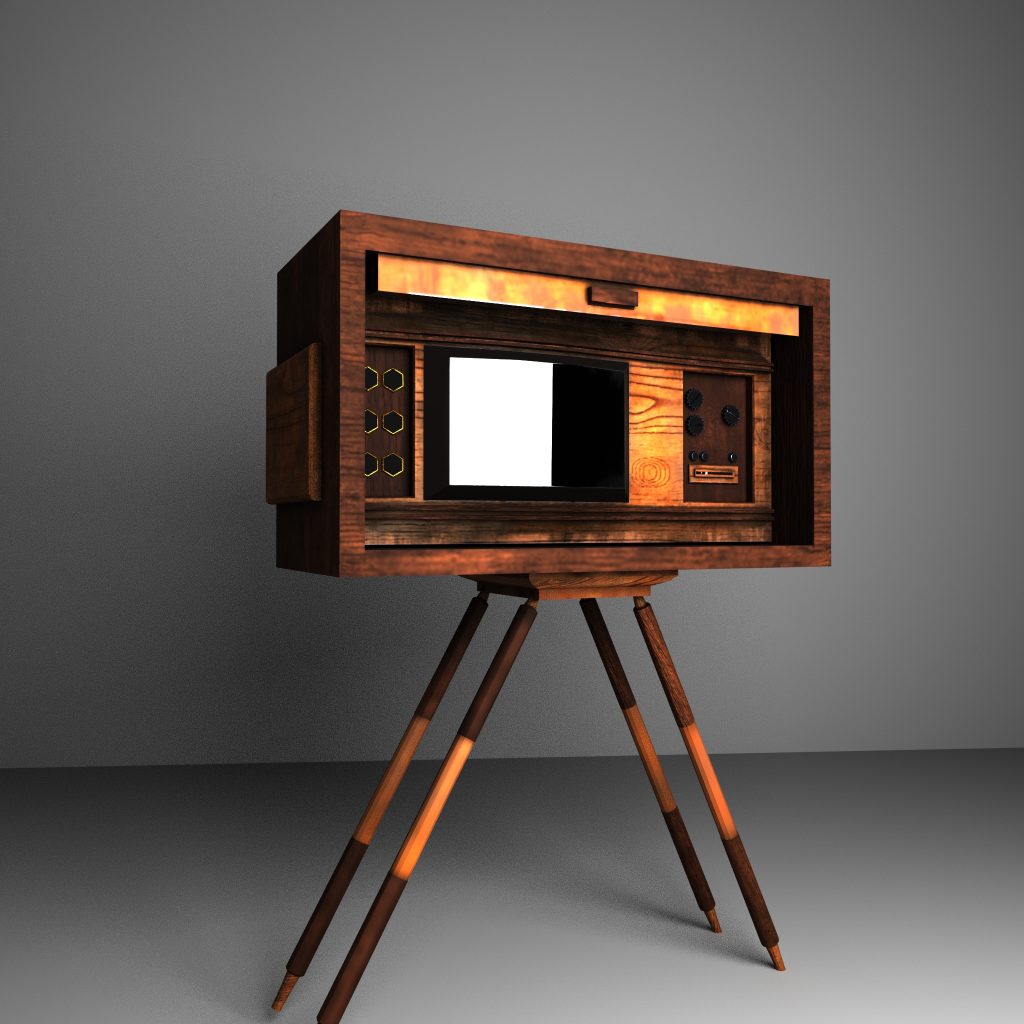
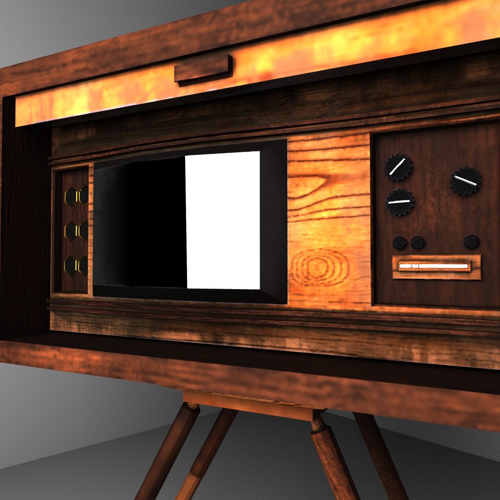
Vintage TV
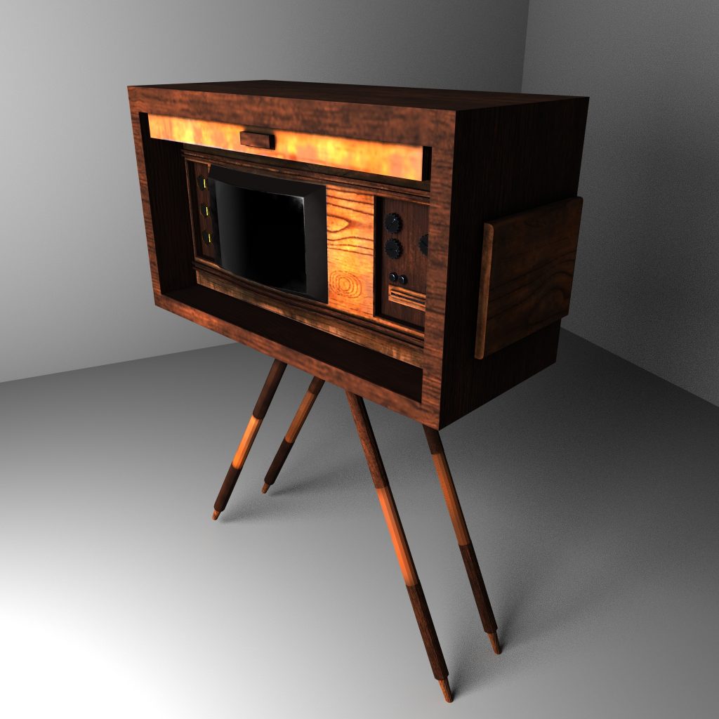
The TV is a much more complex model than the booth seat, and as such used many more layers and textures. I like the reflective glass I used for the screen, and feel like the textures worked okay, though I might have gone back and changed the wood textures to be either more similar or just used one. I think the combination of the two makes the final image look as though the contrast is overdone.
While I do think a different light wood texture would have worked better for the final renders, I think overall the asset looks okay. I also think I used too much wood in the design as in my opinion it doesn’t shout TV when seen.
Pingback: 3D Art for Games – Production – Model 5 + 6 – Booth Seat + 1950’S TV – Fraser Ibbotson – 647603