For my third animation I wanted to experiment with more layers, different effects and heavier use of transitional effects. As usual, I started by creating the 2D assets I would need for the animation, keeping in mind what parts of the assets I would be animating when moved from Illustrator to after effects.
Planning
My niece used to be afraid of going to sleep in her room on her own, making me stay up until she fell asleep before I could leave. I thought it would be fun to make an animation based on this childhood fear. Firstly, I found references for the parts of the scene I thought would benefit and recreated them using Illustrator. I then built these assets into a bedroom environment using assets I made without need of reference.
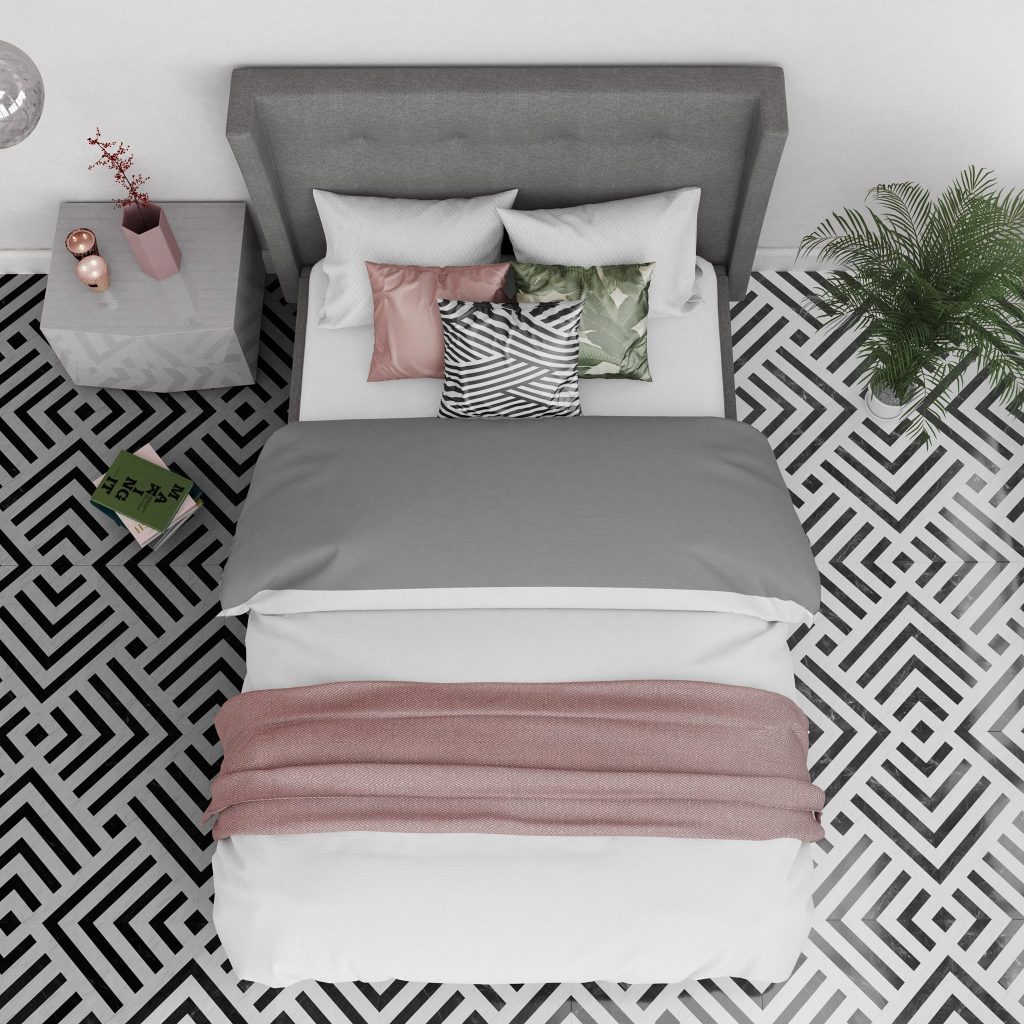
Bensons for Beds 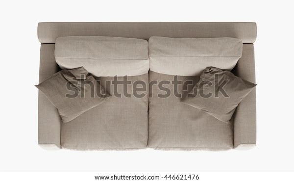
HappyAprilBoy [Shutterstock] 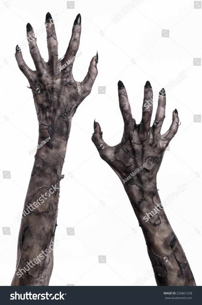
Paradise studio [Shutterstock]
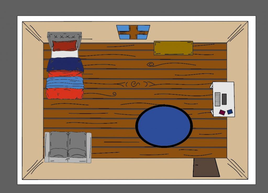
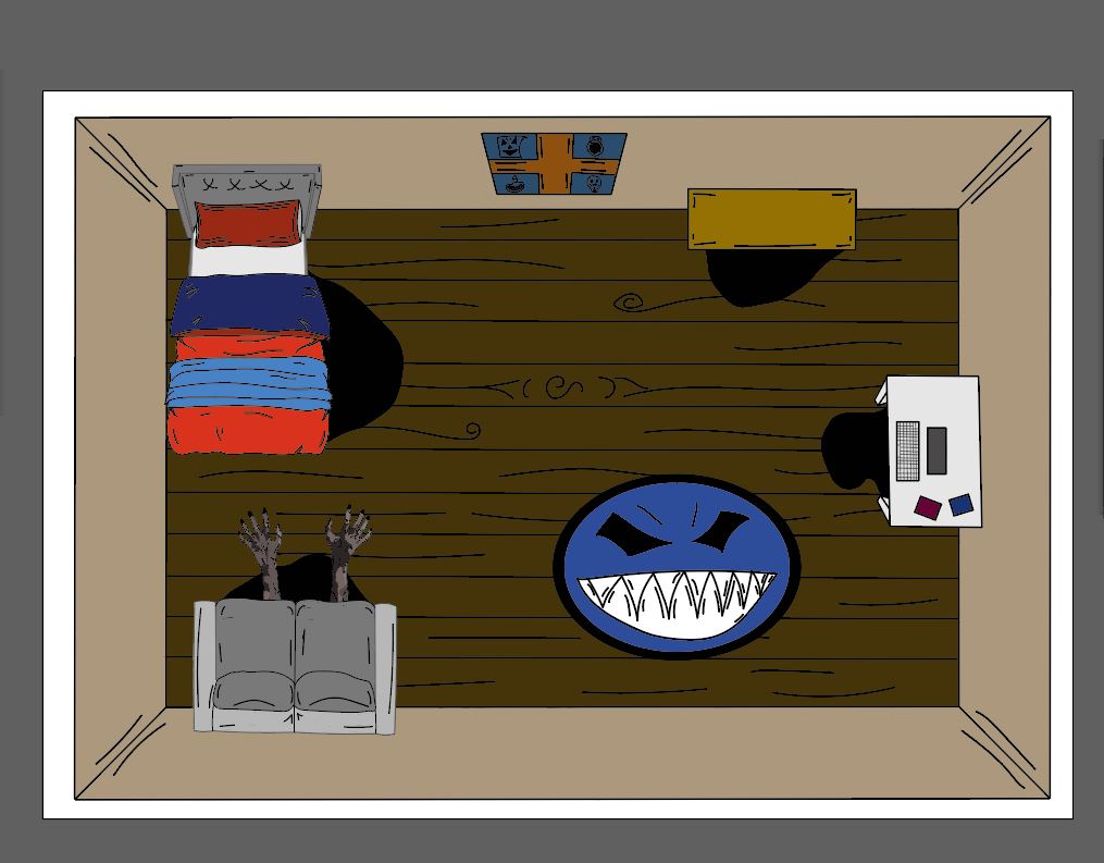
Here you can see the two different rooms I produced. I intend to show the daytime environment long enough to establish the scene but not so long as to bore the audience as this image wont have any animation. I will then have the room shake within the frame and turn into the night time room, where I will animate the shadows ink puddles appearing and zombie hands coming out of those puddles. Its important here not to go for actually scary, but charming in the same way a child saying there is a monster under the bed is charming.
Production
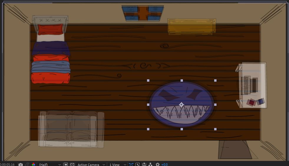
With regards to production, I began by importing my two different rooms into aftereffects (fig.1). I imported these as composition which was necessary for the night shot however not needed for the day shot. It’s not a problem that I imported the day shot as a composition, however having the additional layers which weren’t necessary as the day shot wasn’t animated was a slight error. I also used parenting as I needed to scale the room and furnishings once ported over from Illustrator and didn’t want them to distort each other wan changing size.
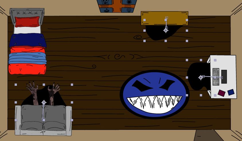
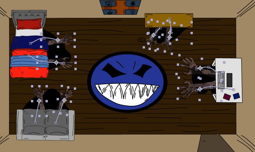
Pretty much all of my work was in making the night room animate as I wanted. I started by animation the shadows to appear under the furnishings and expand to give the impression of spreading ink (Fig.2).
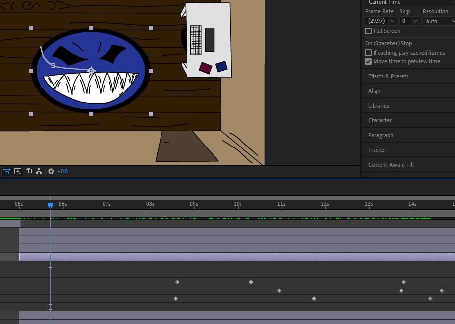
When animating the shadows, I thought it looked a little strange to have the rug, complete with face not move while there is movement all around it. The purpose of this piece is to represent the fear a child feels of their room after dark, and so I thought I should focus in on the rug face (Fig.3). To do this I added a movement path, an increase in scale and a change in rotation as it moves. I didn’t plan to do this, but I think it really works well.
Also, here I added in the monster hands. I only made one left and one right hand and then duplicated it around the scene, in order to save production time (Fig.4). The hands also rotate and turn from transparent to opaque to simulate a monster coming out of the puddles.
Next, I turned my attention to transitioning the day shot into the night shot. I tried a few methods here, I wanted to have the screen shake as it transitioned from one to the other and there are tutorials on youtube. However, they seemed to suggest different methods and I couldn’t get it to work quite right. Instead, I extended the day shot so that it would overhang the night shot by a second and transitioned down the transparency to clear. Reversing the step with the night shot to have one meld into the other. While this isn’t the quick cut I intended I think it helps show a day turning into night.
Also I added a shape layer on top which I had cover the entire screen and turned the colour to a dark grey. I then set this transparency to 40 percent. This was mostly to help blur the transition as some of the furnishings of the day room don’t line up perfectly with the night shot and I thought this to be a good work around.
At this point the video was done, and I needed to source audio to combine with the visuals. I originally intended to have a calm sound for the day shot, then a break where it would be silent and have horror sounds for the night shot. However, when previewing the video, I didn’t think 15 seconds was long enough to have this audio plan work effectively. Instead, I used a wind chime sound effect that ran the entirety of the animation. This was to instantly instil a sense of disturbance in the viewer even for the three seconds they are looking at a still calm shot.
With the background sounds I found a good zombie groan which I staggered four times, to give the effect of a crowd off time with itself.
Finally I added a clowns laugh to the video. I originally intended to have this laugh only sound over the transition however 1 and a half seconds wasn’t long enough for the viewer to recognise the laugh as the track I used starts quiet and I don’t know how to trim scene length in after effects.
Final Thoughts
Below you can see the final animation I ended with. I like the final product, but I think it strayed a little from my original plan more than a would have liked. I don’t think 15 seconds is long enough for the original plan to have worked. I intended to have movement coupled with sound for the day room, perhaps birds tweeting or something else calming. Then have everything go still for a moment before having the night shot take over with her monster calls. 15 seconds wasn’t long enough for this plan to play out organically though. Perhaps if I had used 25 seconds this would have worked.
There is room for refinement here, looking back I would have had the monster face be a separate layer from the rug, which would have allowed me to add some movement to the face itself. Perhaps had the eyes of the rug turn toward the bed or have the smile grow bigger. Also a small touch I would have liked to add in hindsight would be to have a clock on the wall of both rooms, showing daytime hours in the day shot and night-time hours in the night shot. This would have helped show the passage of time.
The idea of making the piece charming I don’t think is in the final animation as much as I would have liked. Instead I think the entire animation is creepy, rather than having that contrast between the equilibrium of the opening and the disruption of the ending.
In terms of my talent within aftereffects however I do feel more confident than with my last piece. I know to have all movements end before the final mark as obviously, when exported to video the viewer won’t see that arc complete if it ends at the time the video does. I want to experiment more with screen effects and masks for my next piece, as I am annoyed I couldn’t figure out how to add a screen shake.
References:
Bensons for Beds (2018). Bensons for Beds timeline [Facebook]. 31st May. Available online: https://www.facebook.com/bensonsforbeds/photos/a-birds-eye-view-of-our-rhapsody-bed-frame-is-the-perfect-shot-to-appreciate-the/1929223330434901/ [Accessed 01/04/2021]
HappyAprilBoy [Shutterstock] (n.d.) Available online: https://www.shutterstock.com/image-photo/modern-sofa-brown-fabric-isolated-on-446621476 [Accessed 02/04/2021]
Paradise studio [Shutterstock] (n.d.) Available online: https://www.shutterstock.com/image-photo/terrible-zombie-hands-dirty-mummy-theme-226861528 [Accessed 03/04/2021]
Vedas (2013). [Freesound.org] wind chimes.wav. Available online: https://freesound.org/people/vedas/sounds/197445/ [Accessed 07/04/2021]
XxWebWorldxX (2017) [Freesound.org] Ghastly Groan. Available online: https://freesound.org/people/XxWebWorldxX/sounds/414136/ [Accessed 07/04/2021]
Nanakisan (2013) [Freesound.org] Evil Laugh 7. Available online: https://freesound.org/people/Nanakisan/sounds/204705/ [Accessed 07/04/2021]
