I need to make at least four animated shorts that in total make up between one and two minutes in length. For this first piece I want to focus on realistic movement in the form of a game studio logo.
Planning
I started by thinking of the logos that I’ve seen many times and thinking of any that I once thought cool. Indeed, labs released ‘State of Decay’ in 2013 and I remember thinking that the logo was very effective. The company has since changed the logo but the original can be found in the games 2013 trailer. I think the combination of the visual elements coupled with the simple sound effects made for a nice logo that really stuck in the mind.
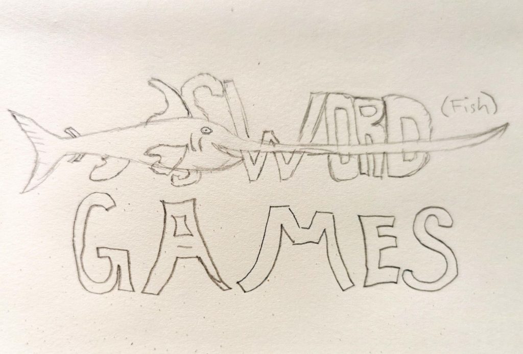
At this point I knew the style I was trying to emulate but I wanted this to be entirely mine. I sketched my idea which helped me figure out what I wanted for the animation. I did originally intend for the fish to spear through the entire ‘swordfish’ text however later changed this to just the ‘H’.
Production
I knew it was possible to move illustrator files into aftereffects but wasn’t sure how so I used the below video as a guide. I also ran into a slight issue with the vector art pixilating however this was fixed by selecting the ‘Continuously render’ option on the layer options.
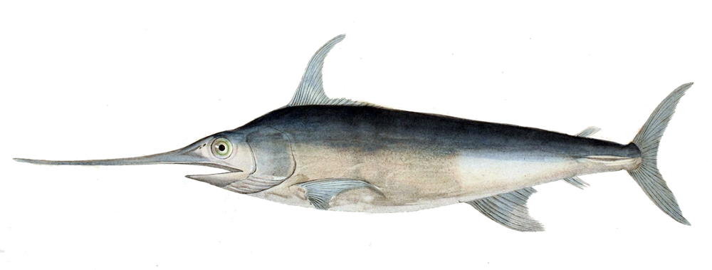
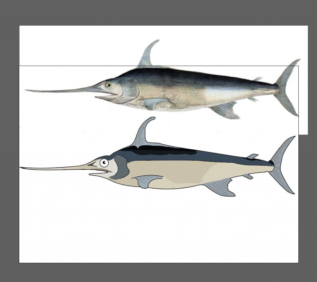
I recreated the below image for my object, as it was the only one, I found that didn’t include the bottom fins of the fish going downward. I should have used a different image as the Shallotte of a swordfish is very recognisable and a part of that is the bottom fins. However, by the time I realised this I had already made my vector image and couldn’t change it. If I were to make this animation again however I would change this.
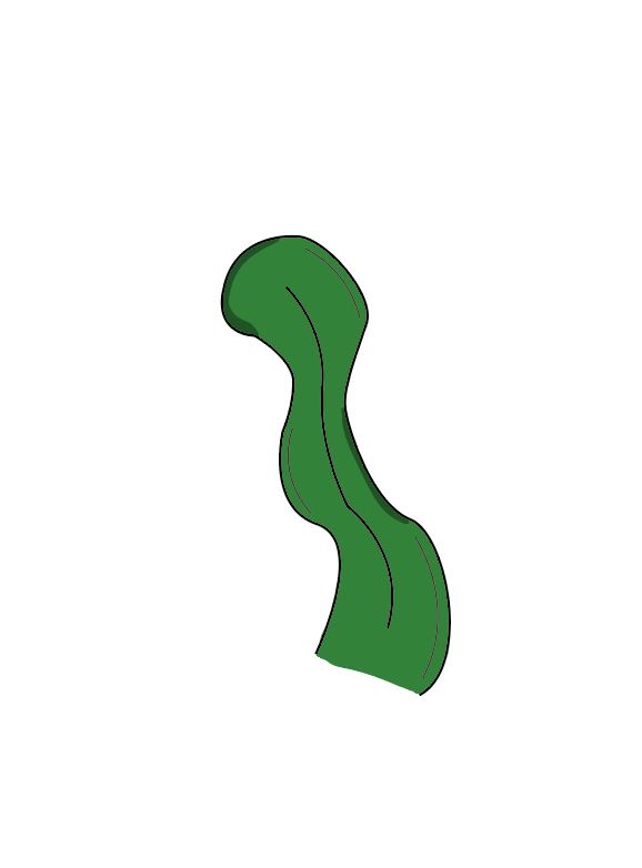
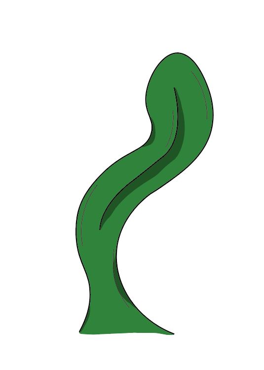
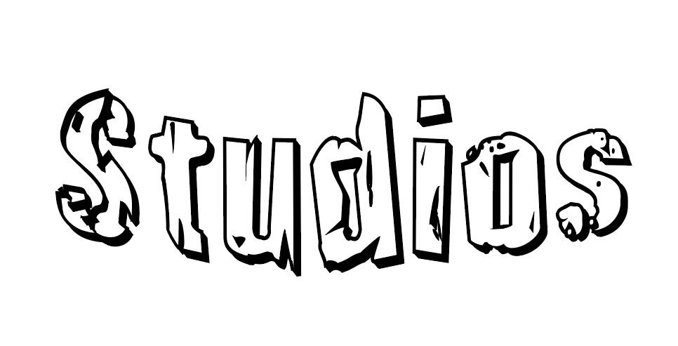
Here you can see the illustrator files I used. I made the fish and the weeds using the same pen tool and paintbrush technique I used throughout 2d art for games last term as it allowed me to blend colours nicely. I also imported the text as vector art, as I wanted the letters to look as thought they had been dropped into water. This was easiest to do by converting the text into outlines in illustrator and then manipulating the different letters as objects.
I used the scale tool to move the reeds in such a way to simulate them being under water and had the text move position as if they were slowly drowning. Then I had the fish swim in from the right-hand side and skewer the two sides of the H, thus completing the word. The whole animation is ten seconds long, as I felt this was enough time to see as the elements on first viewing but not enough to make the logo seem overly long.
Here is my progress with my animation. I haven’t yet added the sound effects and I will later add bubbles to give the animation more depth.
Sound Effects
I didn’t really know the best place to go to get the sound effects I needed. This is also likely to be an issue with the narration style animations I will go on to make. However I found a good source of copyright free audio clips and found a nice deep underwater clip I could use. Also I found a nice stone dropping into water effect from youtube (copyright free) which I had to trim to size before I could use but gave a nice final product.
Final Thoughts
So for the logo I think you can see where the inspiration came from. The sound effects go a long way to making the animation feel complete. I think the illustrator pieces look nice but I think making the video ten seconds was perhaps a mistake. The undead labs logo I used as inspiration was significantly shorter than mine and I think I should have used the same length.
The idea of this video was to have it work as a game studio logo which would be shown when you load the game. However much like when you go see a film in the cinema you don’t want the paramount logo to go on beyond its welcome. I thin perhaps eight seconds would have been a better length.
Feedback from tutor
I got some feedback from Darren once I had a finished video, and he had some thoughts that I thought was very insightful. I took this feedback on board and made alterations to the video which I believe make for a better final animation.
I think whilst the initial part can be speeded up, the ending needs to be considered. At the moment it ends abruptly and I don’t think it needs to. Think of the impact of your swordfish. If the letters in the top line were independent of each other then you could have a little more control over your animation. Yes in the first instance these could progress in the same way sinking down the scene, but when the swordfish hits perhaps the point of the sword fish could hit the other letters and have an impact – stopping the swordfish and giving you a bit more of an ending to the piece.
Conceptually I like the idea – you might also want to consider whether you can do anything within the piece to demonstrate water flow – this would help with the movement of the studios element of the logo, as it sinks. If there is some form of light touch element which signifies that the studio element is getting hit by the flow of the water and is therefore moving across into place below the other element. You may also want to consider whether the bottom of the ocean should be visible and whether the logo should hit the floor.
Darren Mundy
The first change I made was to increase the animation length. In the original the animation ends as soon as the fish pierces the letter, which doesn’t give the viewer time to see the final word. This not only made the animation feel rushed but meant that as a logo it wasn’t effective. In the reference logo the viewer has a few seconds of looking at the complete logo, which allows the viewer to remember the development studio.
In terms of adding an indicator for the water flow I did struggle trying to achieve this. I made a subtle dark blue shadowy shape which I then duplicated and had float upward with the bubbles. I hope this adds a sense of movement to the video. Also I added the ground to the design which I then emphasised by having the ‘studios’ text remain on the ground.
Finally, I also removed the word fish from the title. As I feel like engaging the viewers mind in the way I have would help them remember the studios name more than previously. Even just by forcing the viewer to think about what the name actually is for a second would go a long way to making the name memorable.
I think the second video works a lot better than the first. Even if just by having the viewer look at the logo complete for a few seconds I think it looks much more professional than the original.
References:
Gamespot (2013) [Youtube Video] ‘State of Decay – Official Trailer‘
Available online:
https://www.youtube.com/watch?v=edVYXynxzio&ab_channel=GameSpot [Accessed
23/02/2021]
Nagaty Studio – Sound Effects (2020) [YouTube Video] ‘Stone
dropped in water sound effect no copyright | stone sounds | HQ‘.
Available online:
https://www.youtube.com/watch?v=Za_glRDyilo&ab_channel=NagatyStudio-SoundEffects
[Accessed 04/02/2021]
Abolla (2014) [Freesound.org]. ‘UnderwaterDrowning01.wav‘. Available online: https://freesound.org/people/Abolla/sounds/213914/ [Accessed 24/02/2021]
‘Quarry Stone Font’. Iconian fonts. 101 Freefonts.com. Available online:
https://www.1001freefonts.com/quarry-stone.font [Accessed 07/02/2021]
TipTut (2017) [Youtube Video] ‘Importing Illustrator Files as Shape Layers in AE |
After Effects Tutorial’ Available online:
https://www.youtube.com/watch?v=E3pHatQbZqk&ab_channel=TipTut [Accessed
24/02/2021]
Wikipedia Image, (2021) [Article listing] Available online:
https://en.wikipedia.org/wiki/Swordfish [Accessed 25/02/2021]
