*Disclaimer*. The assignment brief states I need 200 dpi tiff files. I cannot find a method to achieve this in the render setting in maya. These are 200 ppi tiff files, I have spoken with one of the lecturers and believe these should be high quality enough to fulfil the criteria.
Drinks Dispenser
The final design is okay, and I can’t say I’m disappointed with it but I do feel like there’s something missing from it. I think the model would have done well with a stencil placed on the top bar of steel, perhaps using the coca cola logo to make it more obvious what the model is. The tiles worked well, much better than they did with the coffee machine.
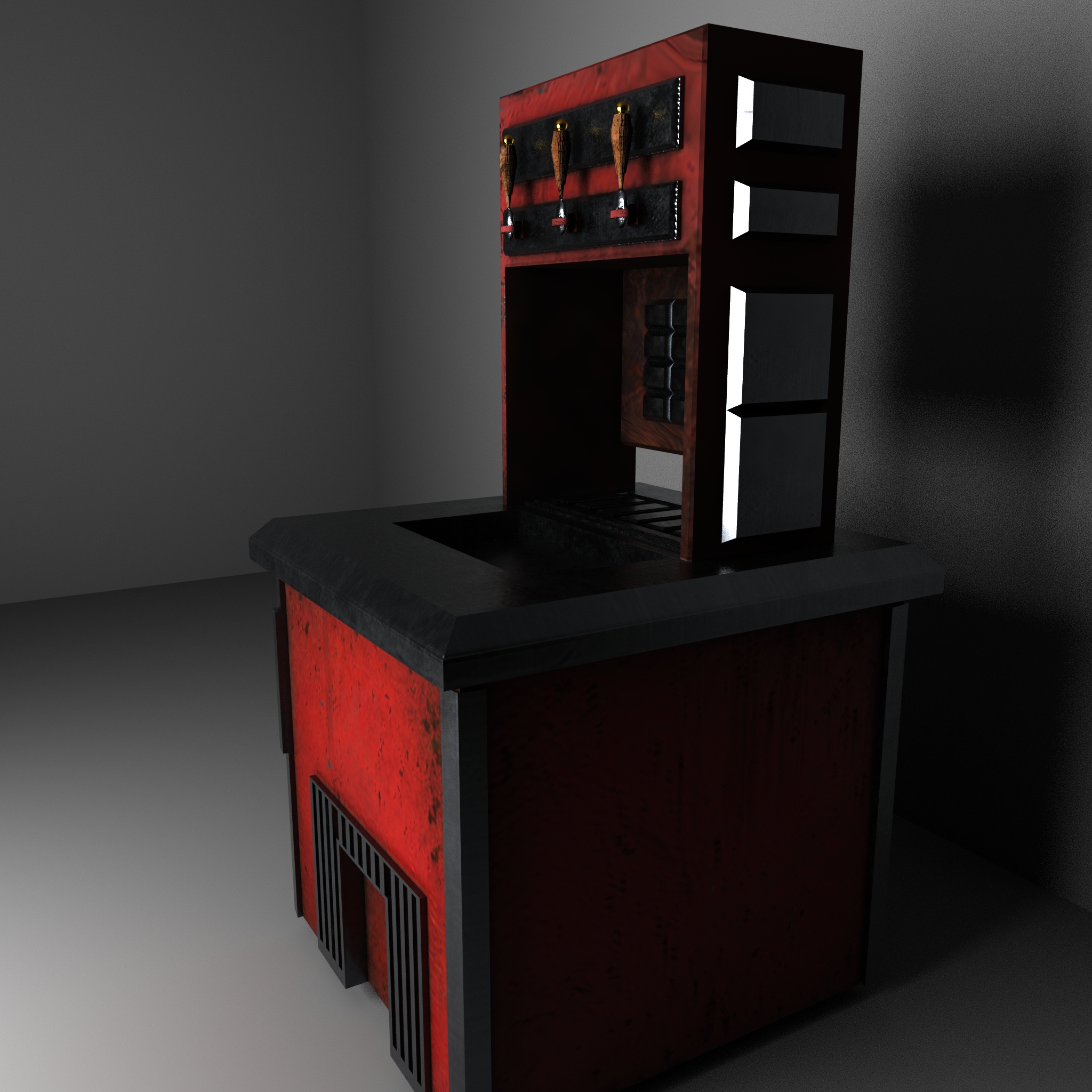
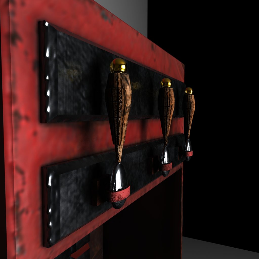
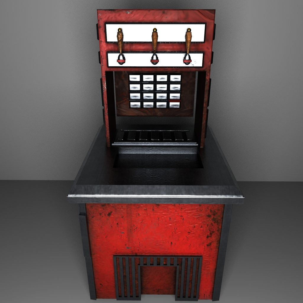
The touch of gold on top of the handles I think works well as a means of breaking up the otherwise limited colour pallet, and I have tried to hide the strange tile section in my renders. I think the materials I chose work well together, and overall, I am happy with the asset. I just think it kind of looks more like something you would see in a mechanics workshop than an American diner.
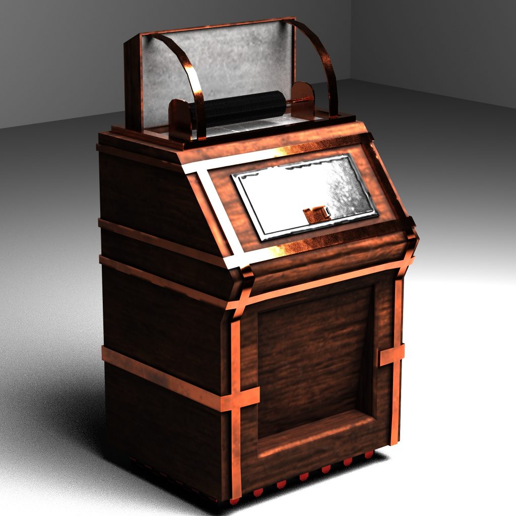
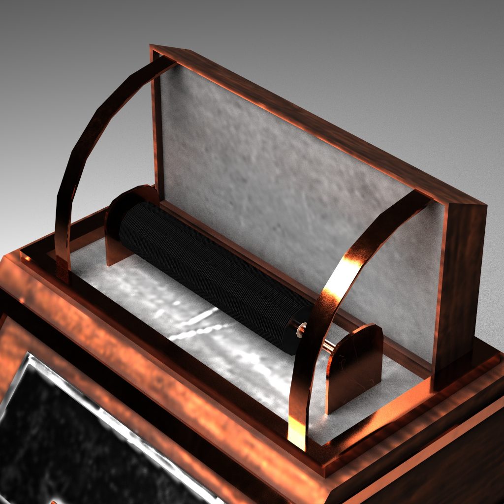
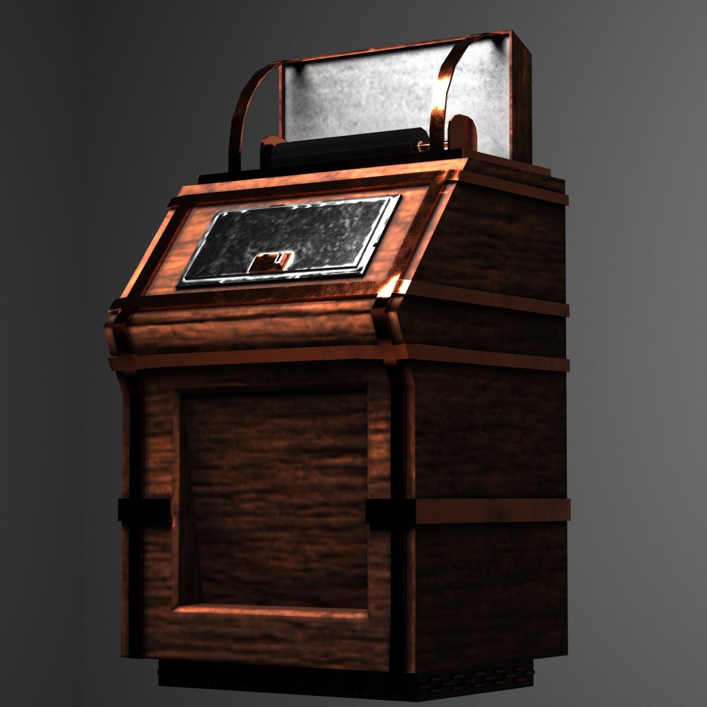
Jukebox
I had some issues with texturing and rendering this model, but I am overall happy with the result. I do think I was right to not make the classic jukebox design but instead go for the more unusual version, and I am very happy I managed to learn how to get glass to work in substance and Arnold. Now obviously the glass top is not amazingly clear given how there is no reflection of anything in the renders but for that reason alone this model is one I am proud of just for teaching me this new method.
The wood finish looks good and the copper works much better than a more standard steel or aluminium. One thing I would change however is change the indented panel to be something more similar to the speaker I made with the TV. Something about the model just looks slightly unfinished to me, and I think this would have helped. To that end I think I would have done well if I made a song selection sheet to go on the steel plate, as right now it looks a little bare. Also the bottom plate, while present in the references I used looks a little out of place with the rest of the design.
Pingback: 3D Art for Games – Production – Model 7 – Retro Drinks Dispenser – Fraser Ibbotson – 647603
Pingback: 3D Art for Games – Production – Model 8 – Jukebox – Fraser Ibbotson – 647603